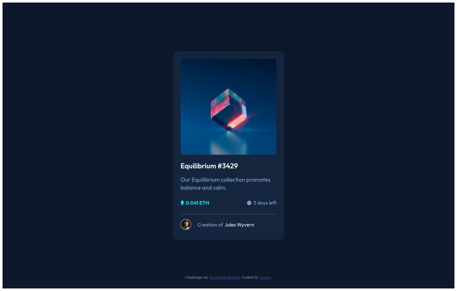
Preview Card || with flexbox and hover-effects
Design comparison
Solution retrospective
Please give feedback! What did I do good and how can I make it even better?
Please log in to post a comment
Log in with GitHubCommunity feedback
- @borakb
- The image hover overlay and the image have different border-radius
- The Ethereum and the Clock icon are not aligned in the middle of their container, to fix this add
display: flexandalign-items: centerto the.priceand the.time-leftdiv elements
If this has helped you I would appreciate if you could mark my feedback as useful! Thank you for reading.
Marked as helpful - @M0hamedF
Great job 👍 you made it look nearly perfect to the preview. You can make the transition smoother by adding "transition: 0.3s; or what suits you in sec " by adding it in 1- ".hover:hover" will make it change smoothly to the color. 2- ".hover" will change it back. For more info click on the link "https://www.w3schools.com/css/css3_transitions.asp" Keep up the good work!
Marked as helpful
Join our Discord community
Join thousands of Frontend Mentor community members taking the challenges, sharing resources, helping each other, and chatting about all things front-end!
Join our Discord
