


@faridlakbarSubmitted about 1 year ago
Latest solutions
Rest Countries Api with color theme switcher (next.js and tailwindcss)
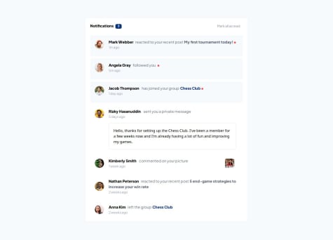
#accessibility#next#react#tailwind-css#fetchSubmitted about 1 year agoResponsive Notification page using Next.Js andTailwindcss
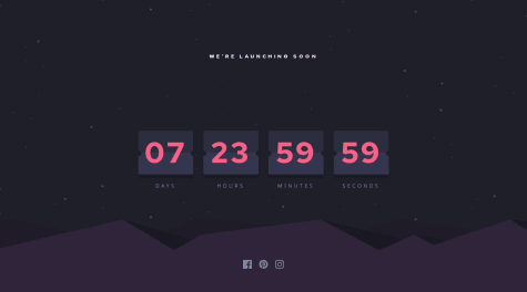
#next#tailwind-css#reactSubmitted about 1 year agoResponsive Countdown Timer using Nextjs14 , Tailwindcss , pure-CSS
#animation#next#tailwind-cssSubmitted about 1 year agoResponsive website using Nextjs , Bootstrap , SCSS
#bootstrap#next#react#sass/scssSubmitted almost 2 years ago
Latest comments
- @KarimAyman97Posted about 1 year ago
Hi faridlakbar Great Job! I have some recommendations for you
1- try to use separate file for CSS styling * for example *
<head><link rel="stylesheet" href="styles.css" /></head>this will help improving code readability2- try to change
<div class="card"> to a <main class="card">and the<div class="attribution"> to a <footer class="attribution">this does not affect your project visually but it improves SEO as well as the accessibility of your project.
I hope it helps!
Other than that, great job!
0 - @eldon6219Submitted about 1 year ago@KarimAyman97Posted about 1 year ago
great Job ! but always try to Provide a more descriptive alt attribute for your image:
<img src="assets/images/image-omelette.jpeg" alt="Delicious Omelette">Other than that, great job!
1 - @umutcankocamisSubmitted about 1 year ago@KarimAyman97Posted about 1 year ago
Hello Umutcan Kocamış Great Job!
I would like to suggest a solution. Begin by setting a transparent border for each button initially. Upon hover, apply the desired color and adjust the border accordingly
.sedans .learn-more {
        color: hsl(31, 77%, 52%);
        border: 1px solid transparent;  // give it initially transparent border
}


.sedans .learn-more:hover {
  border-color: hsl(0, 0%, 95%);  // give it the desired colored border on hover
  color: hsl(0, 0%, 95%);
  background-color: hsl(31, 77%, 52%);
}
Marked as helpful0 - @JaroslavHosovskySubmitted about 1 year ago@KarimAyman97Posted about 1 year ago
Hi , Great Job! simple recommendation each <img> should have alt attribute which describes the image
<img src="img/illustration-article.svg" alt="Illustration for the article" />this ensures accessibility and also improves overall SEO
i hope it helps !
0 - @revanthv999Submitted about 1 year ago@KarimAyman97Posted about 1 year ago
hi revanthv999 Great Job !
1- for your question Here are some best practices to arrange components vertically
a) Use block-level elements such as <div>, <section>, <article>, or <p>
b) Use the CSS Flexbox layout for vertical alignment. The flex-direction: column;
c) CSS Grid Layout . Set the grid container's grid-template-rows
2- I have some accessibility and semantics recommendations for you.
try to change
<div class="container">to a<main class="container">also each image should have alt attribute which describes the image<img class="profile_photo" src="./assets/images/avatar-jessica.jpeg" alt='avatar-jessica'>this does not affect your project visually but it improves SEO optimization as well as the accessibility of your project.
I hope it helps!
Other than that, great job!
Marked as helpful0 - P@andrewteeceSubmitted about 1 year ago@KarimAyman97Posted about 1 year ago
hi Andrew Teece great job !
i have a simple comment that every <img> should have descriptive so
<img src="assets/images/avatar-jessica.jpeg" class="card--img" alt="" />should be<img src="assets/images/avatar-jessica.jpeg" class="card--img" alt="avatar-jessica" />I hope it helps!
Other than that, great job!
Marked as helpful0


