Not Found
Not Found
Not Found
Not Found
Not Found
Not Found
Not Found
Not Found
Not Found
Not Found
Not Found
Not Found
Not Found
Not Found
Not Found
Not Found
Not Found
Not Found
Not Found
Not Found

All solutions

  • Submitted


    What are you most proud of, and what would you do differently next time?

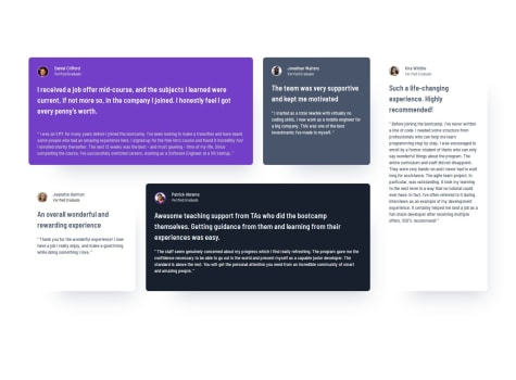
    • I am pleased with this project because I learnt the basics of CSS Grid and in particular Grid with media queries to create the collage for desktop.
    • Also, in the CSS I attempted to group classes and elements together in an attempt to write less code. I have a bad habit of repeating code in the CSS file unnecessarily. Not having I don't think any redundant code. Although, I may be wrong, when someone looks at it! lol.
    • What would I do differently? Maybe not use section element for each testimonial card.

    What challenges did you encounter, and how did you overcome them?

    • CSS Grid takes time to get my head around. I think this is the third or fourth project in which I have attempted to use it. It does take time, but I think I am slowly getting to grips with it.
    • Organising HTML has always been a problem for me. I tend to overdo it with the divs and containers, however in this project I have calmed down a bit!!

    What specific areas of your project would you like help with?

    • Organising my HTML and when to use semantic elements and which semantic element to use and when to use divs for styling purposes.
    • Naming classes appropriately is another issue I could do with help on. I attempt to make the class names as descriptive as possible.
  • Submitted


    What are you most proud of, and what would you do differently next time?

    First project, up and running!

    What challenges did you encounter, and how did you overcome them?

    Centering the whole thing!

    What specific areas of your project would you like help with?

    How to center elements

  • Submitted


    What are you most proud of, and what would you do differently next time?

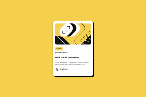
    I am happy with how the project looks. I think it is very close to the Figma file, and I also centred the card using CSS Flexbox with justify-content (centre) and align-items (centre). This works well on all projects and can be done with CSS Grid also.

    What challenges did you encounter, and how did you overcome them?

    I often have problems structuring my HTML on every project. Over-coding is the phrase I use, whereby I have too many outer containers which as I move on to the CSS styling I see that they are unnecessary. However, the blog card looks ok on the browser, so although I could refactor the code, I would come out with the same result on the browser.

    What specific areas of your project would you like help with?

    As I mentioned in the last section I tend to add too many containers. In this project I have a semantic main acting as an outer container and also semantic section acting as another container within the semantic main container. I am also attempting to get to grips with grouping elements and classes in the CSS. This will take time to understand.

  • Submitted


    What are you most proud of, and what would you do differently next time?

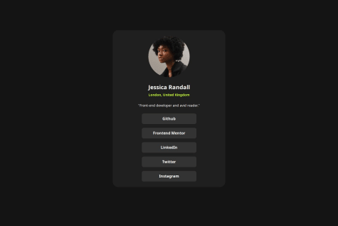
    I am relatively pleased with this and I feel it looks good on the browser. I am pleased with the positioning of the card on the screen, for this I used margin-top 8rem, and margin left and right auto. If I was to do this project again I perhaps would use CSS Flexbox to position the card in the middle of the screen. I am also pleased with how the anchor tags worked in "social links" section.

    What challenges did you encounter, and how did you overcome them?

    Once again my greatest challenge was structuring the html. Too many outer containers, this is because I am attempting to use semantic HTML. I have an "main" outer container and within that I have "section" called "container." Should I not just used main as outer container?

    What specific areas of your project would you like help with?

    Structuring the HTML.

  • Submitted


    What are you most proud of, and what would you do differently next time?

    • I am happy with the responsiveness of this project.

    • Also happy with how it looks on the browser.

    What challenges did you encounter, and how did you overcome them?

    • I struggled with CSS Flexbox on this project but overcame it.

    What specific areas of your project would you like help with?

    • CSS Flexbox
  • Submitted


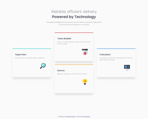
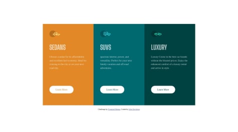
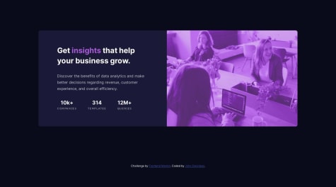
    This is my third challenge completed using CSS Grid. Two of the sections had cards that needed to be positioned in a laddered/staggered manner. One with staggered columns and the other with staggered rows. Implicit Grid kicked in at one point when I commented out my solution, and it worked fine! You know when you solve a problem and you do not know how you did it? That is the way it was for me creating multiple rows. Not sure if it done in a best practice fashion but it works. If anyone can have a look at the two sections using Grid that would be great. Also, all the work over the last dozen projects to create effective README's is paying off, does not take long now, and I find writing them beneficial as it solidifies some of what I have learned in the project.

  • Submitted


    What are you most proud of, and what would you do differently next time?

    I am happy with the way CSS Grid worked on this project. I used Grid columns and rows and was able to lay out the cards as according to the design. Perhaps if I was creating this project again I would maybe use Grid to make it responsive instead of media queries.

    What challenges did you encounter, and how did you overcome them?

    Figuring out the theory of CSS Grid and putting it into practice. The column and row principle takes a bit of getting used to.

    What specific areas of your project would you like help with?

    CSS Grid

  • Submitted


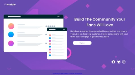
    Project number 10 completed. First responsive landing page using CSS Grid and although not pixel perfect, I am reasonably happy with it. Lessons learned or at times re-learned include:

    • Use css to deploy a background image via a url. I had actually forgotten this could be done!
    • Icons, I had forgotten also how to use png files from FontAwesome, what I had forgotten was placing the link within the html head.
    • Styling the icons in css.
    • One thing I am not confident with in this project is having to use negative top margin for one of the elements (computer and phone mockup). This was the only way I could get the element placed where I want it. Works ok until the project is expanded toward desktop where in that process the element covers the logo completely.
    • Comments and advice warmly welcomed.
  • Submitted


    Hi folks, another newbie project completed. This was my first venture into the wonderful world of CSS Grid. I had to watch a number of tutorials and read a few docs to get my head around the basics. This was a helpful project to get feet wet in this. Once again the help on in the Discord community was awesome, thanks guys. One or two things below of interest.

    • I did struggle with Grid to begin with, at times no matter how many docs I read or tutorials I watched actually putting into practice is difficult. I knew starting the project that would be the case. It was the same when learning Flexbox, yet a number of projects later Flexbox is becoming less daunting, this is only accomplished with practice and building projects. Therefore I knew Grid would be a struggle, but we must wrestle with it to become familiar with it.

    • I feel I am still wrestling with the padding/margin/gap and when to use each one. Once again, building projects and wrestling with it is the only way. I do feel I am making progress with this.

    • I have started to get into the habit of creating variables for colors, fonts, and box-shadows in the css file. I am fully aware these small projects only have a small number of each, however, I feel it is a worthwhile habit to ingrain.

    • Another aspect that I am finding super helpful is writing the README and recording what I am learning. I feel this solidifies my learning, and I am becoming more familiar with markdown. For the screenshots of completed project I am now creating a folder alongside the index.html and styles.css etc in VSC and just linking from there. Maybe I am late to the party in realising this, but is so super quick to do.

    • All feedback welcome. One particular question I have is I am using too many classes? Almost every element I create in the html seems to have a class.

    • Thanks to Chamu and Grace Snow in Discord community for their invaluable help once again.

  • Submitted


    Another project submitted. Happy days πŸ˜€. Enjoyed this one with its minimalist layout. I used Flexbox flex-column property for the mobile setup and changed to flex row with a media query for desktop view.

    Learned a lot, funnily enough, it was creating the README that I realised the simple answer to attaching screenshots of completed projects. Simply, create a README folder for screenshots and link to that. Not sure if this is best practice but works a treat for me.

    All in all, it is not pixel perfect but I am generally pleased with it and feel more confident going on to the next one. Becoming more familiar with the whole git/github process is invaluable too. I try to commit often and I am adding more detail and becoming more specific in my commit details.

    Any feedback warmly welcomed. Thanks. I also created global variables in the :root of stylesheet for primary and secondary colours and fonts. This I believe is good practice for moving on to larger more complex projects with more colours and fonts than is used in the newbie projects.

  • Submitted


    Updated submission. Issues I am experiencing are to do with layouts.

    • I feel I am using too many divs unnecessarily.

    • Am I using CSS Flexbox when a simple block element will do, in particular when using the column property?

    • I find it rather tricky coming up with meaningful class names that correspond with each other in meaning.

    • I have left in code that I did not use in the final edit, I just commented it out. I feel I need to know when l look back where I have gone wrong and edited accordingly.

    • Feedback on html structure issues would be most welcome

    • Thanks

  • Submitted


    Another challenge completed πŸŽ‰ πŸ’ͺ. Thanks πŸ™ to Alex in the Discord group for his advice. It is not perfect but progress is achieved through repetition and small steps for me anyway. Learning CSS Flexbox with each of these newbie projects and flex gap is my new best friend πŸ˜‚. With six projects now complete I feel it is time to perhaps comment and help one or two who are have completed their first project. Comments and advice how I could improve this project gratefully accepted.

  • Submitted


    Project number five complete, happy days πŸŽ‰ πŸ€›.

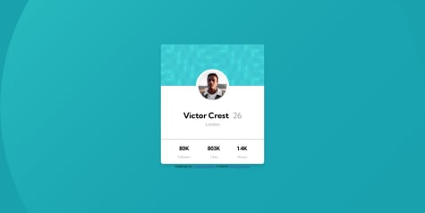
    Enjoyed learning to place avatar in centre of card using position relative/absolute and translate property. It is certainly true that the more you build the more your confidence grows. Also, the Slack (now Discord) community is awesome, what great folk and what a great resource.

    On to the next one πŸ’ͺπŸ˜€

  • Submitted


    Third project completed πŸŽ‰. Massive learning curve on this one. I am finding the only way to become familiar with layouts and CSS Flexbox is trial and error as I code. It is far from perfect but I feel I am learning from my mistakes. The gap property in Flexbox has become my new best friend πŸ€› . It is so easy to form bad habits. I would like to thank Grace in the Frontend Mentor Slack community for her invaluable helpπŸ™.

  • Submitted


    What are you most proud of, and what would you do differently next time?

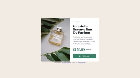
    I learned the clip property for accessibility, using a class named "visually hidden" for the strikethrough over the "original price." Also the first time using picture element for the image, which has a media query embedded in the HTML with two sources. I also learned how to embed screenshots in the README file, I have included a short Youtube video which showed me how this is done.

    What challenges did you encounter, and how did you overcome them?

    How to make it responsive was the problem I faced. However using media queries solved this.

    What specific areas of your project would you like help with?

    Responsiveness.

  • Submitted


    Hello good folks at Frontend Mentor,

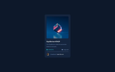
    Here is my second project completed. One aspect I found challenging was placing the small "eye" SVG image over the main image. It is meant to show when cursor is hovering over main cube image. I am yet to complete that. If anyone has any tips that would be greatly appreciated.

    Thanks in advance -- John