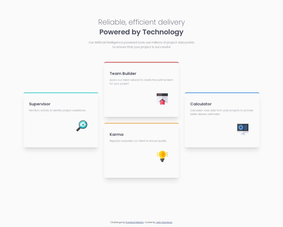
Design comparison
SolutionDesign
Solution retrospective
What are you most proud of, and what would you do differently next time?
I am happy with the way CSS Grid worked on this project. I used Grid columns and rows and was able to lay out the cards as according to the design. Perhaps if I was creating this project again I would maybe use Grid to make it responsive instead of media queries.
What challenges did you encounter, and how did you overcome them?Figuring out the theory of CSS Grid and putting it into practice. The column and row principle takes a bit of getting used to.
What specific areas of your project would you like help with?CSS Grid
Community feedback
Please log in to post a comment
Log in with GitHubJoin our Discord community
Join thousands of Frontend Mentor community members taking the challenges, sharing resources, helping each other, and chatting about all things front-end!
Join our Discord
