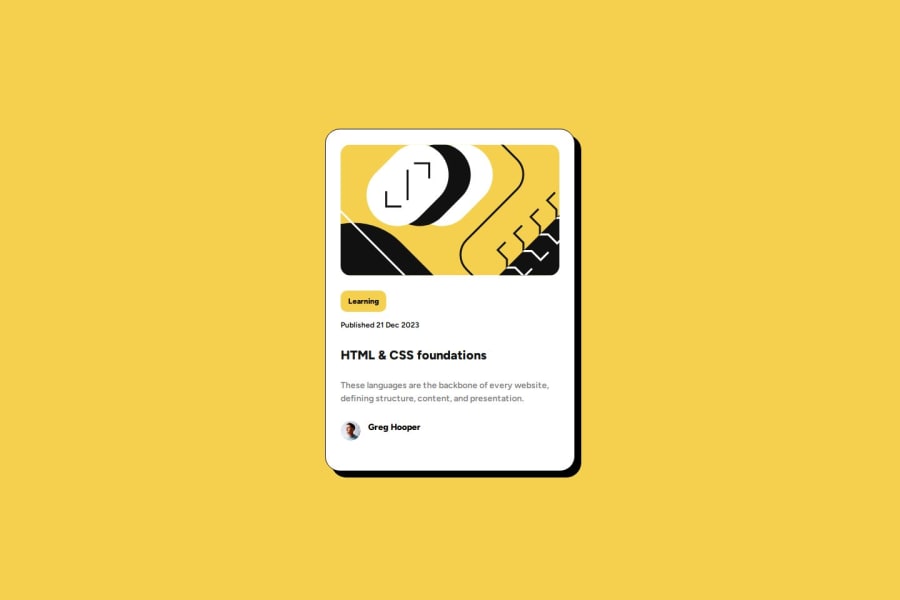
Newbie Project Complete using HTML and CSS only.
Design comparison
Solution retrospective
I am happy with how the project looks. I think it is very close to the Figma file, and I also centred the card using CSS Flexbox with justify-content (centre) and align-items (centre). This works well on all projects and can be done with CSS Grid also.
What challenges did you encounter, and how did you overcome them?I often have problems structuring my HTML on every project. Over-coding is the phrase I use, whereby I have too many outer containers which as I move on to the CSS styling I see that they are unnecessary. However, the blog card looks ok on the browser, so although I could refactor the code, I would come out with the same result on the browser.
What specific areas of your project would you like help with?As I mentioned in the last section I tend to add too many containers. In this project I have a semantic main acting as an outer container and also semantic section acting as another container within the semantic main container. I am also attempting to get to grips with grouping elements and classes in the CSS. This will take time to understand.
Community feedback
Please log in to post a comment
Log in with GitHubJoin our Discord community
Join thousands of Frontend Mentor community members taking the challenges, sharing resources, helping each other, and chatting about all things front-end!
Join our Discord
