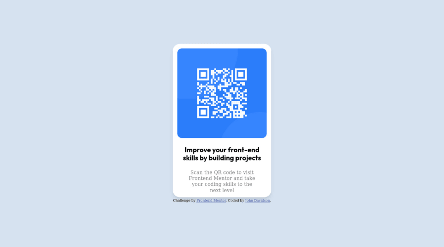
First project: mobile first using CSS Grid.
Design comparison
Solution retrospective
Updated solution using CSS Flexbox instead of CSS Grid for centering. A big shout out to @ecemgo and @Panji200 for their invaluable advice.
Community feedback
- @pperdanaPosted over 1 year ago
Hello there👋!! Congratulations on completing this challange.
- I have some additional recommendations for your code that I think you'll find interesting and valuable.
📌 Image element do not have
altattributes or you leave it blankfor example code
<img src="images/image-qr-code.png">In this code you should add
altin your code<img src="images/image-qr-code.png" alt="qr code" >- This
altattribute provides alternative text for images, which is important for accessibility purposes. Screen readers, use the alt attribute to read out loud what the image is about, allowing visually impaired users to understand the content of the page.
I hope you found this helpful! 😊
Happy coding🤖
Marked as helpful0@John-Davidson-8Posted over 1 year agoHey Panji, many thanks for pointing that out to me 🙏😀
0 - @ecemgoPosted over 1 year ago
Some recommendations regarding your code that could be of interest to you.
- I think Flexbox is better than Grid in centering both horizontally and vertically. I recommend this method, it's up to you whether to apply it or not :)
- If you want to make the card centered, you'd better add flexbox and
min-height: 100vhto thebody - You don't need to use
paddingfor thebodyand you can give the background-color for the screen
body { /* padding: 2rem 2rem; */ background-color: var(--clr-grey); display: flex; flex-direction: column; justify-content: center; align-items: center; min-height: 100vh; }- If you use flexbox in the
body, you don't need to usemarginin the.qr-codeto center the card - If you want to give the gap between the content and the border of the card, you can use
padding - If you use
max-widthinstead ofwidthandheight, the card will be responsive
.qr-code { /* width: 320px; */ max-width: 320px; padding: 15px; /* height: 497px; */ background-color: var(--clr-white); /* margin: 0 auto; */ /* align-self: center; */ border-radius: 1.5rem; box-shadow: var(--shadow-3); }- In addition to that above, in order to make the card responsive and the image positioned completely on the card, you'd better add
width: 100%anddisplay: blockfor the img in this way:
img { width: 100%; display: block; border-radius: 5%; }- Finally, you don't need to use
main,.containerand.product-imgyou can remove them and you'd better try to avoid repetition
/* main { min-height: 100vh; display: grid; place-items: center; grid-template-columns: 1fr; } */ /* .container { width: 375px; height: 667px; background-color: var(--clr-grey); display: grid; } */ /* .product-img { width: 288px; height: 288px; margin: 1rem; border-radius: 1rem; overflow: hidden; } */- You can reach my README file from here and you can view, it may be a sample for you
Hope I am helpful. :)
Marked as helpful0@John-Davidson-8Posted over 1 year agoMany thanks on your valuable advice, I'll get to work 🙏 ecemgo
1@John-Davidson-8Posted over 1 year agoHey Ecem, your solutions worked a treat, once again many thanks🙏😀 John
1
Please log in to post a comment
Log in with GitHubJoin our Discord community
Join thousands of Frontend Mentor community members taking the challenges, sharing resources, helping each other, and chatting about all things front-end!
Join our Discord
