


@MuhammadSami1
Latest solutions
Job listings with filtering built with Next
#accessibility#next#typescript#tailwind-cssSubmitted 2 months agoThere is one thing I wasn't able to figure out: on mobile screens, when adding filters, they get squished once they wrap onto a new line. I worked around this by giving them a min-height, but I feel that there has to be a better solution. I don't understand why this behavior happens, the container can grow in height to accommodate for new lines as I didn't limit its height anywhere. So if anyone has an explanation for this, I'm all ears!
IP Address Tracker built with Next
#tailwind-css#typescript#nextSubmitted 3 months agoCurrently, when I open the page on a mobile device, the styling below causes the content to be cut off at the bottom because the space taken up by the address bar doesn't get taken into account (so the actual content doesn't span the full height of the viewport). Any ideas on how to fix this would be welcome!
<main className="flex min-h-screen flex-col justify-end">Todo App built with Next
#accessibility#tailwind-css#typescript#nextSubmitted 4 months agoI can't think of any specific questions right now, but I'm not very experienced at working with Next yet, so if you have any feedback or would like to suggest improvements, I'd love to hear it!
Interactive Comment Section built with Next
#accessibility#next#tailwind-css#typescript#daisy-uiSubmitted 4 months agoI can't think of any specific questions right now, but any and all feedback as to how I can improve my solution is welcome!!
E-commerce product page built with React and TailwindCSS
#accessibility#react#tailwind-css#typescriptSubmitted 5 months agoMy one main issue is with centering the open shopping cart on mobile screens. I positioned it absolutely, which works for bigger screens, but I just haven't been able to figure out how to center it on the page on small screens. I don't want to use a fixed position because I don't want it to cover the other content when I scroll. Someone please tell me how to solve this issue, as I know my current solution to this isn't a good one.
Another thing I haven't managed to figure out is how to prevent the nav links from moving up a little to accommodate for the added border at the bottom upon hovering.
Other than that, I don't have any specific questions right now, but any feedback is welcome!
News homepage built with React and TailwindCSS
#accessibility#react#tailwind-css#typescriptSubmitted 5 months agoThere's is a horizontal scrollbar at the bottom of my page and I don't understand why that is. If someone can point me to any flaws in my styling that might be causing an overflow, please go ahead!
Also, this is not technically something I need help with, but I noticed that while the design works on laptops and mobile screens, it doesn't look super great on medium-sized screens. I guess that's just due to the layout though. I considered adding a media query to make the page a one-column layout for medium-sized screens where the articles on the right-hand side would be in a row rather than a column, but I ultimately decided against it.
Latest comments
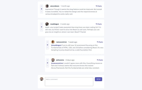
- @Jenny-Eikens
Hi Muhammad,
great effort on the challenge! 🙂
Here's a few points you might want to consider to make it even better:
-
Currently, you can vote on your own comments. This is something you could prevent by conditionally disabling the plus and minus buttons (i.e. checking if the username of the comment is identical to that of the currentUser object). You can also currently vote below 0. I don't know if that is on purpose, but if it isn't, you could prevent this by simply checking if the score is greater than 0 and only enabling the button if it is.
-
This is more of a design thing and not an issue in terms of functionality, but you might want to add the
hover:cursor-pointerclass to interactive elements (such as buttons) so it will be clear to the user that the element is indeed interactive. -
At the moment, it is possible to submit a reply that contains only the
@replyingTo, so you're essentially submitting an emtpy reply. When adding a comment, you're already making sure it's not empty, so you can do the same for replies. -
Regarding the use of Tailwind's responsive breakpoints: I noticed you currently define widths, margins etc. for bigger screens and then add a different value for small screens. This is generally not considered a good practice. Instead, you should start at the smallest screen width and add breakpoints for bigger screens (i.e. use a mobile-first approach). Refer to Tailwind's docs for more detailed information on this.
-
Lastly, you can only delete top-level comments and not replies at the moment. I struggled with this myself, and learned that you need recursion to be able to do this. This is definitely not an easy concept to understand, but personally I found this video helpful.
Hope this helps! 🙂
Marked as helpful -
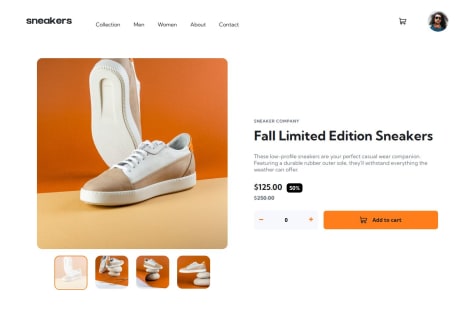
- @AndresLamar@Jenny-Eikens
Hey Andres,
congrats on completing the challenge! :)
Here's some ideas on how you could improve your code:
-
You might want to consider limiting the width of the main content (your Product component). Currently, the design ends up looking too stretched out on very large screens because the gap between your .product-images and .product-info is allowed to grow wider and wider.
-
This point is something I learned from feedback someone gave me on one of my solutions: Don't hard-code data into your website, as this will very much hinder maintainability (i.e. if you want to showcase a different pair of shoes and thus have to change the product title, description, pricing etc., you'd have to go into the actual code and change the data in the relevant places). A better solution to this is to put all data that is subject to change in the future into separate JSON files to reference in your code (like you already did with your images). That way, you could just call something like
{product.description}in your code, and have the actual description in a separate file where you could easily change it in the future. -
The close button when the overlay is open doesn't work. I think this is because of event propagation of the click event. When the button is clicked, its
onClickhandler is invoked first, but then the event bubbles up to the overlay and itsonClickhandler gets triggered too, causingsetImageSelected(null)to be called twice. Instead, try defining a separatehandleButtonClickfunction that stops event propagation and looks something like this:
const handleButtonClick = (e: React.MouseEvent<HTMLElement, MouseEvent>) => { e.stopPropagation(); setImageSelected(null); };- Lastly, the thumbnails aren't centered underneath the main image. (This only becomes noticable starting at a screen width of about 1,970px). To fix this, simply add
align-items: centerto your .product-images.
Hope this feedback helps :)
-
- @AutumnsCodeWhat are you most proud of, and what would you do differently next time?
I’m particularly proud of successfully using Next.js for the first time in this project. It allowed me to leverage its powerful features for server-side rendering and static site generation, which significantly improved the performance and SEO of my application.
Additionally, I took the initiative to separate components throughout the project. This not only made the codebase cleaner and more maintainable but also enhanced my understanding of React’s component-based architecture.
I effectively utilized CSS Grid and Flexbox to create a responsive layout, which helped ensure the site looks great on all devices. This was a valuable learning experience, as I gained confidence in implementing modern CSS techniques.
Lastly, I added a simple yet effective 404 page, which improved the overall user experience by providing clear navigation and support for users who might stumble upon a broken link.
What challenges did you encounter, and how did you overcome them?Challenges Encountered:
Mobile Navigation Implementation: One of the primary challenges I faced was implementing the mobile navigation. Ensuring that the navigation menu was both user-friendly and responsive required careful attention to detail. I needed to ensure that it worked seamlessly across different screen sizes and devices.
Solution: To address this, I utilized a combination of useToggle from the react-use library to manage the open/close state of the mobile navigation. Additionally, I ensured that the navigation appeared smoothly by using CSS transitions for a better user experience.
Event Handling with onClick: Initially, I was unsure how to handle the event propagation correctly when closing the mobile navigation. I considered creating a separate function to manage this, which felt overly complex.
Solution: Instead, I simplified the approach by using
onClick={(e) => e.stopPropagation()}directly in the JSX. This allowed me to prevent clicks on the overlay from closing the navigation while keeping the code clean and straightforward.Key Events Management: Another challenge was managing keyboard events for accessibility. I wanted to ensure that users could navigate the mobile menu using their keyboard, which is crucial for inclusivity.
###Solution: I implemented event listeners to handle key events, allowing users to open and close the navigation using the keyboard. This improved the overall accessibility of the mobile navigation and ensured a better experience for all users.
What specific areas of your project would you like help with?I need some help with accessibility, and any other feedback is welcome.
@Jenny-EikensHi there, Sarah!
Great job on this challenge, the design turned out really well.
Since you asked about advice regarding accessibility of the menu toggling button:
You made a pretty big effort with adding event listeners and defining the buttons for opening and closing the menu separately. You could save yourself some time (and a good few lines of code too) by just creating a state variable to determine whether the menu is open or closed and then conditionally rendering the correct button. See the example below:
const [menuOpen, setMenuOpen] = useState(false);

{/* Button outside of nav element */}
<button
  onClick={() => setMenuOpen(!menuOpen)}
  >
  {menuOpen ? close : hamburger}
</button>
(Note: Here, close and hamburger are the svgs to be displayed depending on the state of the menu. I put them into variables to make the code look cleaner.)
You also do not need to worry about defining an escape key listener. Modern browsers take care of the accessibility of interactive elements. The menu toggling button can be accessed via the space key. This is (thankfully) not a functionality you have to implement yourself.
Hope this helps :)
Marked as helpful - @HeahlWhat are you most proud of, and what would you do differently next time?
Added some small improvements to the UX.
What challenges did you encounter, and how did you overcome them?Wanted to go with a styled component approach to the form fields first, but figured out this is way more (unnecessarily) complicated than duplicating some code. Would likely go for this approach in a bigger project though.
@Jenny-EikensHi Heahl!
Nice job on the contact form.
There are a few minor adjustments I would suggest to make the form look and function event better.
I see you set the width of the form to 90vw. That works great on mobile devices, but I do think it looks a bit oversized on larger screens. To work around this, maybe consider setting a max-width. I also noticed that setting the main's min-h to screen causes it to take up more than 100 of the viewport height, so you have to scroll to get to the submit button. I would suggest reducing the min-h to something like 70vh.
Another thing I noticed is that if I try entering numbers in the name input fields, I don't get any errors. Consider adjusting your validation to make sure the inputs only accept letters.
I haven't worked with Zod for form validation, so I don't know exactly how that works, but I saw in your code that you used state variables for all input fields. Out of curiosity, I was just wondering why that is and if you could maybe explain to me if that is necessary for the validation process? If not, how come you chose to use so many state variables?
Again, great job on the form and happy coding :)
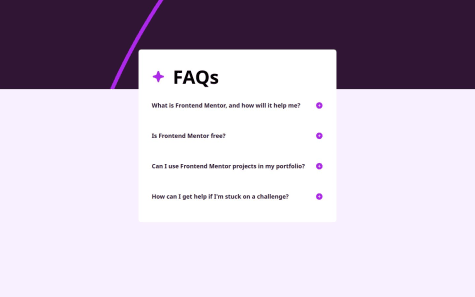
- P@NikitaVologdinWhat challenges did you encounter, and how did you overcome them?
I encountered a problem positioning the component in the centre of the viewport using flex, grid or positioning and at the same time preventing it from growing beyond the viewport when expanding content. I justified content in the center and for Y-axis positioning used a margin-top, but the component doesn’t have bottom margins and it looks a bit odd.
What specific areas of your project would you like help with?If anyone has any ideas about positioning in the centre of the viewport and prevent component to go beyond the viewport please be my guest.
@Jenny-EikensHi Nikita,
great job on the challenge! :)
Regarding your issue with centering the component, I would suggest the following:
In your index.css file, remove the margin-top from your main element. Also remove the margin-bottom from your faq element. Give the body a height of 100vh rather than 100% to make sure it spans the entire height of the viewport. You already have the display of your body set to flex, and you've centered the component horizontally by applying justify-content: center. All that's missing is adding align-items: center, so your content will be properly aligned along the cross axis as well (in your case, vertically). The final code should look something like this:
body {
    display: flex;
    justify-content: center;
    align-items: center;
    height: 100vh; /* Ensures the body takes the full viewport height */
    margin: 0;     /* Removes any default margin */
  }
This turns your body into a flex container and aligns all content within it in the center.
Hope this helps :)
- @NexusLoWhat are you most proud of, and what would you do differently next time?
👋 Hi everyone! This is my solution for the interactive-rating challenge with a minor ongoing issue
What challenges did you encounter, and how did you overcome them?🏋️ I didn't manage to make the circles on which the user clicks stay highlighted
What specific areas of your project would you like help with?✍️ Judging by my code and using React, how would you manage to keep the white color of a circle once selected?
@Jenny-EikensHi Cedric!
Good effort on this challenge!
I have some suggestions that might help you out. First off, to your question about the radio buttons not changing color upon clicking them: You’re applying the checked property to the label rather than the input, which is why the styles aren’t being applied. To fix this, try applying the following in your styles.css file:
input[type='radio']:checked {
(put desired styles here);
}
Now the desired styles should be getting applied :)
Also, the labels aren't associated with their input fields. This is a problem because screen readers and such won't be able to associate the label with the corresponding input. You might want to try giving each input an id and giving the corresponding label a for attribute like so:
<label
className='card__radioinput'
for='button1'
>
<input
type='radio'
id='button1'
className='sr-only'
onClick={() => setUserChoice(1)}
/>
<span>1</span>
</label>
Consider giving each input the same name property (e.g. name='selectionButton') to make sure only one can be selected.
I also noticed that currently, it is possible to submit the form without having selected a rating. You could try avoiding this by slightly altering your handleClickSubmit function. Before setting isRated to true, check if userChoice is empty like so:
if(userChoice ===  '') {
alert("Please select a rating!")
return
}
Lastly, regarding responsive sizing, as the screen gets smaller, the contents overflow their container. I had the same issue and found the following helpful:
Instead of giving your .cardBS_div and .cardTK_div a width, height, min-width, and max-width, try only setting a width and min-width OR height and min-height and then setting an aspect ratio so the card will scale responsively.
Hope you find these ideas helpful!
Happy coding :)