
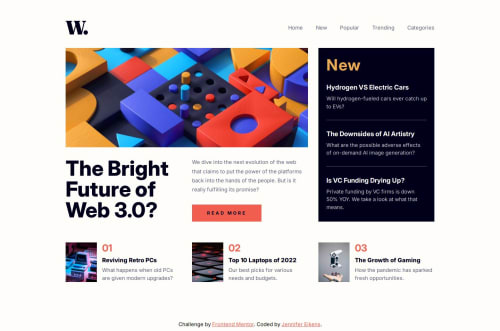
News homepage built with React and TailwindCSS
Design comparison
Solution retrospective
I learned more about CSS grid for this project. I found the use of grid-template-areas in particular very helpful for creating the responsive layout of the page. This approach saved me a lot of time and effort.
What challenges did you encounter, and how did you overcome them?By far the biggest challenge for me in this project was the nav bar. I am not super confident in the realm of positioning in general and conditional positioning especially. It took me a while to get to the point where I could display the nav at the top on bigger screens and have it slide in from the side on smaller screens.
I also had never previously worked with an overlay for when the side menu is open, so that was a challenge as well. Overall, I'd like to keep working on my CSS grid skills and get more confident in positioning elements.
I also noticed that I don't yet fully understand how to pass variables and functions down as props in React, which is something I would like to work on in future projects.
What specific areas of your project would you like help with?There's is a horizontal scrollbar at the bottom of my page and I don't understand why that is. If someone can point me to any flaws in my styling that might be causing an overflow, please go ahead!
Also, this is not technically something I need help with, but I noticed that while the design works on laptops and mobile screens, it doesn't look super great on medium-sized screens. I guess that's just due to the layout though. I considered adding a media query to make the page a one-column layout for medium-sized screens where the articles on the right-hand side would be in a row rather than a column, but I ultimately decided against it.
Community feedback
- @dylan-dot-cPosted 4 months ago
Well done on this challenge especially with using react but there are a few things you can improve on...
-
Your components are a bit dense... they aren't really reusable unless someone is gonna work on the exact same challenge. To me, if you want to change a blog or update it in the future you should just change the data and not the code itself. This also comes back to the idea of hardcoding your website, in the real world you would create small components like(Latest News or TopNews) and fetch the data for them. Don't take it to heart but you are solving this like you are using vanilla js and not a framework... you need to get into that mindset.
-
You can make use of semantic elements like articles(which they infact are...lol) instead of all those divs you have there. You can also make use of the section element.
-
FOr the overflow... I can't really say... its weird but it could be some width/margin or even the mobile navbar you have why it's overflowing... can't say for sure tho. Actually...(did another quick check) it's the
100vw
you have on the body element that causes the overflow, so just remove that. Also all block level elements automatically take up full width so you dont need that and the thing is thatvw
don't take into account the vertical scrollbar on the right so it would still take up that space and not limit it.
Basically for making it resusable, turn the data for the blogs(the repeated parts more importantly) into an array of json objects so you can just map out them and pass it the values like title, description, image, id? that make it distinct. That's how you truly leverage the power of js frameworks. This approach could even be done with vanilla js as well. So it's important to know the fundamentals.
You can also check out my solution(did it a long time ago so I haven't applied my new knowledge since then) but it shows how to use the components and even the images properly as you don't really need to use
process.env
to use images, it's better to import them and keep them in the assets folder than public which makes them easier to use.Marked as helpful0 -
- @AdrianoEscarabotePosted 4 months ago
Hello Jenny Eikens, how are you? I was really pleased with your project, but I’d like to offer some advice that might help:
I noticed that you used a button in which case the best option would be an a, because in my head when a person clicks on a button written
Read More
, he is not confirming a form, or something like, it will be redirected to another page, to Read More about!to solve this problem do this:
<a href="/">Read More</a>
The rest is spot on.
Hope it’s helpful to you. 👍
1@Jenny-EikensPosted 4 months agoThanks for the advice! I hadn't considered that the "read more" wouldn't expand content but lead the user to a different page. Now that you mention it, I totally see that an a element would be better suited.
1
Please log in to post a comment
Log in with GitHubJoin our Discord community
Join thousands of Frontend Mentor community members taking the challenges, sharing resources, helping each other, and chatting about all things front-end!
Join our Discord