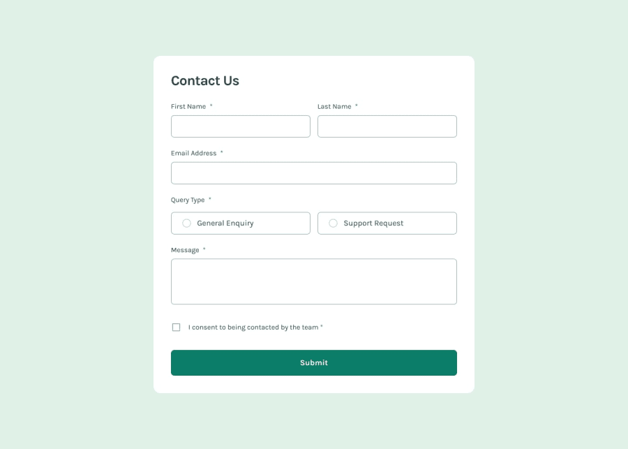
Design comparison
Solution retrospective
Added some small improvements to the UX.
What challenges did you encounter, and how did you overcome them?Wanted to go with a styled component approach to the form fields first, but figured out this is way more (unnecessarily) complicated than duplicating some code. Would likely go for this approach in a bigger project though.
Community feedback
- @Jenny-EikensPosted 4 months ago
Hi Heahl!
Nice job on the contact form.
There are a few minor adjustments I would suggest to make the form look and function event better.
I see you set the width of the form to 90vw. That works great on mobile devices, but I do think it looks a bit oversized on larger screens. To work around this, maybe consider setting a max-width. I also noticed that setting the main's min-h to screen causes it to take up more than 100 of the viewport height, so you have to scroll to get to the submit button. I would suggest reducing the min-h to something like 70vh.
Another thing I noticed is that if I try entering numbers in the name input fields, I don't get any errors. Consider adjusting your validation to make sure the inputs only accept letters.
I haven't worked with Zod for form validation, so I don't know exactly how that works, but I saw in your code that you used state variables for all input fields. Out of curiosity, I was just wondering why that is and if you could maybe explain to me if that is necessary for the validation process? If not, how come you chose to use so many state variables?
Again, great job on the form and happy coding :)
0
Please log in to post a comment
Log in with GitHubJoin our Discord community
Join thousands of Frontend Mentor community members taking the challenges, sharing resources, helping each other, and chatting about all things front-end!
Join our Discord
