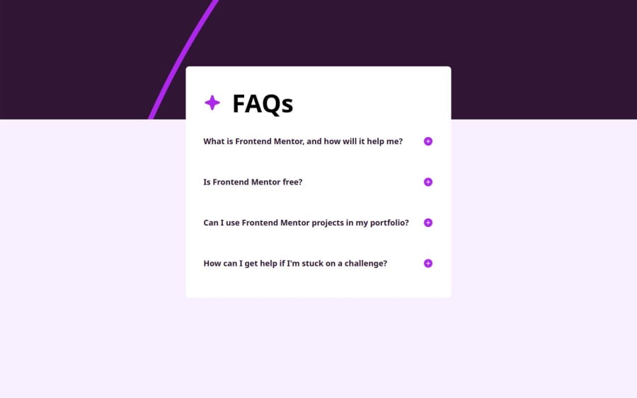
Design comparison
Solution retrospective
I encountered a problem positioning the component in the centre of the viewport using flex, grid or positioning and at the same time preventing it from growing beyond the viewport when expanding content. I justified content in the center and for Y-axis positioning used a margin-top, but the component doesn’t have bottom margins and it looks a bit odd.
What specific areas of your project would you like help with?If anyone has any ideas about positioning in the centre of the viewport and prevent component to go beyond the viewport please be my guest.
Community feedback
- @Jenny-EikensPosted 5 months ago
Hi Nikita,
great job on the challenge! :)
Regarding your issue with centering the component, I would suggest the following:
In your index.css file, remove the margin-top from your main element. Also remove the margin-bottom from your faq element. Give the body a height of 100vh rather than 100% to make sure it spans the entire height of the viewport. You already have the display of your body set to flex, and you've centered the component horizontally by applying justify-content: center. All that's missing is adding align-items: center, so your content will be properly aligned along the cross axis as well (in your case, vertically). The final code should look something like this:
body {
    display: flex;
    justify-content: center;
    align-items: center;
    height: 100vh; /* Ensures the body takes the full viewport height */
    margin: 0;     /* Removes any default margin */
  }
This turns your body into a flex container and aligns all content within it in the center.
Hope this helps :)
0
Please log in to post a comment
Log in with GitHubJoin our Discord community
Join thousands of Frontend Mentor community members taking the challenges, sharing resources, helping each other, and chatting about all things front-end!
Join our Discord
