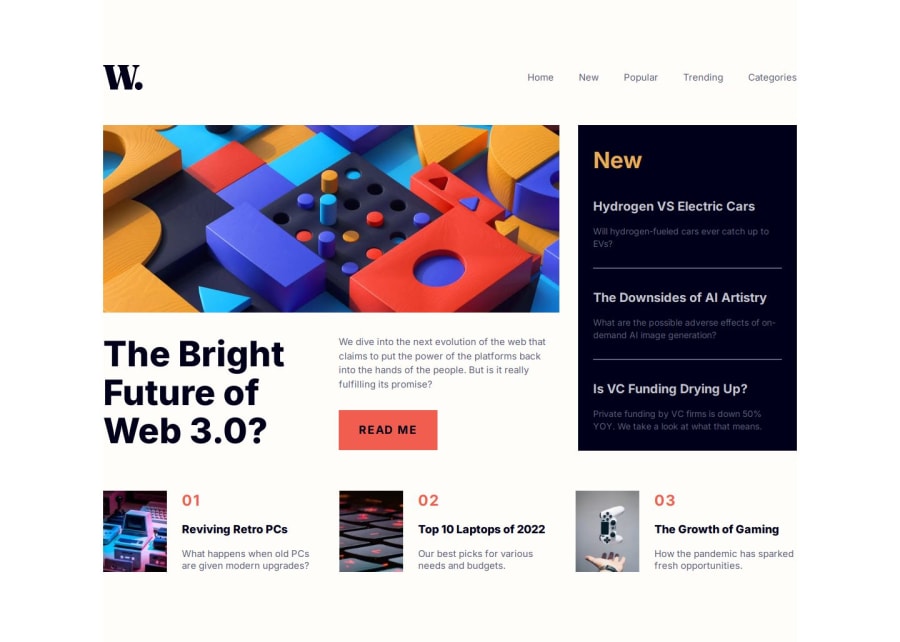
NextJs, Tailwind, typescript - News homepage
Design comparison
Solution retrospective
I’m particularly proud of successfully using Next.js for the first time in this project. It allowed me to leverage its powerful features for server-side rendering and static site generation, which significantly improved the performance and SEO of my application.
Additionally, I took the initiative to separate components throughout the project. This not only made the codebase cleaner and more maintainable but also enhanced my understanding of React’s component-based architecture.
I effectively utilized CSS Grid and Flexbox to create a responsive layout, which helped ensure the site looks great on all devices. This was a valuable learning experience, as I gained confidence in implementing modern CSS techniques.
Lastly, I added a simple yet effective 404 page, which improved the overall user experience by providing clear navigation and support for users who might stumble upon a broken link.
What challenges did you encounter, and how did you overcome them?Challenges Encountered:
Mobile Navigation Implementation: One of the primary challenges I faced was implementing the mobile navigation. Ensuring that the navigation menu was both user-friendly and responsive required careful attention to detail. I needed to ensure that it worked seamlessly across different screen sizes and devices.
Solution: To address this, I utilized a combination of useToggle from the react-use library to manage the open/close state of the mobile navigation. Additionally, I ensured that the navigation appeared smoothly by using CSS transitions for a better user experience.
Event Handling with onClick: Initially, I was unsure how to handle the event propagation correctly when closing the mobile navigation. I considered creating a separate function to manage this, which felt overly complex.
Solution: Instead, I simplified the approach by using onClick={(e) => e.stopPropagation()} directly in the JSX. This allowed me to prevent clicks on the overlay from closing the navigation while keeping the code clean and straightforward.
Key Events Management: Another challenge was managing keyboard events for accessibility. I wanted to ensure that users could navigate the mobile menu using their keyboard, which is crucial for inclusivity.
###Solution: I implemented event listeners to handle key events, allowing users to open and close the navigation using the keyboard. This improved the overall accessibility of the mobile navigation and ensured a better experience for all users.
What specific areas of your project would you like help with?I need some help with accessibility, and any other feedback is welcome.
Community feedback
- @Jenny-EikensPosted 5 months ago
Hi there, Sarah!
Great job on this challenge, the design turned out really well.
Since you asked about advice regarding accessibility of the menu toggling button:
You made a pretty big effort with adding event listeners and defining the buttons for opening and closing the menu separately. You could save yourself some time (and a good few lines of code too) by just creating a state variable to determine whether the menu is open or closed and then conditionally rendering the correct button. See the example below:
const [menuOpen, setMenuOpen] = useState(false);

{/* Button outside of nav element */}
<button
  onClick={() => setMenuOpen(!menuOpen)}
  >
  {menuOpen ? close : hamburger}
</button>
(Note: Here, close and hamburger are the svgs to be displayed depending on the state of the menu. I put them into variables to make the code look cleaner.)
You also do not need to worry about defining an escape key listener. Modern browsers take care of the accessibility of interactive elements. The menu toggling button can be accessed via the space key. This is (thankfully) not a functionality you have to implement yourself.
Hope this helps :)
Marked as helpful0
Please log in to post a comment
Log in with GitHubJoin our Discord community
Join thousands of Frontend Mentor community members taking the challenges, sharing resources, helping each other, and chatting about all things front-end!
Join our Discord
