


@Yeimy7Submitted over 2 years ago
Hi there 👋 I'm Janos, a self-taught software developer from Hungary 🇭🇺 I quit my job at the age of 47, because I wanted to change career paths and start doing what I'm really passionate about. I've been in ❤️ with coding since I was a boy. We've got a pretty long history together (I first learnt
I’m currently learning...GraphQL, Typescript, Next.js
Latest solutions
Responsive multi-page site made with React & React Router
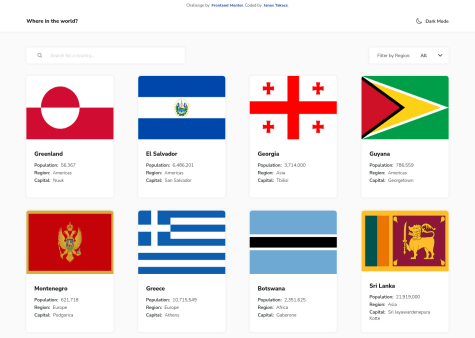
#fetch#react#react-router#sass/scss#styled-componentsSubmitted over 2 years agoREST Countries API with color theme switcher
#fetch#react#semantic-ui#styled-componentsSubmitted over 2 years agoRock-paper-scissors game built with React styled components
#react#sass/scss#styled-componentsSubmitted over 2 years ago
Latest comments
- @JT1974Posted over 2 years ago
Hey Yeimy 👋
I think something went wrong during the deployment, because when I click a card, it does not open/display. I tried it in Chrome, Safari and Firefox too. 😞 Maybe a path issue?
I also couldn't filter the regions, it just does not react, although the search works fine.
Meantime I looked into your code and it looks awesome. Very well organized and structured, split, separated into smaller chunks, great, great job for the first sight! 🙂 👍
I hope, I can review the fully working solution, because so far I like your solution the most...
Good luck with that! Cheers
Marked as helpful1 - @escarcanSubmitted over 2 years ago@JT1974Posted over 2 years ago
Hey Carlos 👋
Your solution looks perfect! Great job! 👍 I like the white space and the responsiveness too. Even if you struggled with hooks, the app works perfectly and your code is also clean and easy to read.
In case you would like to improve it, you may (or may not) want to consider some of my thoughts:
Tip #1: for such small projects, maybe downloading icons instead of using react-icons can be a good idea to reduce dependencies
Tip #2: also, for only 2 routes, maybe using conditionals instead of the great (tiny) wouter can be another good idea, which may not reduce your bundle size too much, but probably it's easier and good enough for small projects
Tip #3: a stateful header component with dark class added to the body could be an alternative for switching themes, although your solution looks and works perfectly too
Overall, very nice solution, congratulations! 👏
Marked as helpful1 - @Queen-codesSubmitted over 2 years ago@JT1974Posted over 2 years ago
Hey Queen-codes 👑👋
Great work, congratulations! The website looks stunning! 👏 Nice SASS with module imports and easy-to-read semantic HTML! I like that a lot.
If you would like to further improve the site, I would suggest a few things, that may help you.
The main navigation links aren't clickable when hovering over the bottom of the area (because hyperlinks are not covering the list items fully). Tip: it works for the submenus, maybe the same logic could be implemented in the main nav too?
The alignment of the different items is quite important in this design. For instance the header horizontal line (your <div class="border"...) is aligned with the page title and in some cases the content too. Tip: the simplest fix is using css-grid e.g., that aligns your items properly.
White space is also lacking in some cases, and some images are a bit too large, which pushes the content out of the viewport in some of the required screen sizes. The typography is not always inline with the design either. Tip: Figma provides easy-to-use tools to check alignment and measure whitespace, and provides the css properties of the elements in the Inspect tab. 👍 Makes the coding a lot easier. To learn about that, look for Gary Simon's videos, but I guess you can find tutorials on freeCodeCamp.org too.
The horizontal line is sliding off in desktop view. Tip: this could be fixed by adding a :before pseudo-class to the main navigation, instead of using a separate container just for the border.
The submenu link jumps up a bit when I hover over it, due to the border-bottom. Tip: it can be fixed by setting a border by default, but making it transparent and during hover you just change the border-color. Nice little trick to make it look even better. 😉
Overall, I like you site, I think it's beautifully created, so well done! 👏🙂
0 - @prantiknoorSubmitted over 2 years ago@JT1974Posted over 2 years ago
Hey Prantik 👋
Nice solution, congratulations! 👏
I have a few ideas how you could further improve your code to make your site look even better.
On mobile, the EXPLORE button is quite big, actually it takes up approx. 40% of the height of the screen. Even though it's a CTA, it might be a little smaller to create some whitespace.
The same goes for the planet's name, the typography there doesn't follow the design (it's 100px in mobile, 80px in tablet, then again 100px in desktop view). EUROPA doesn't even fit to the screen. You can set the font-size, along with white-space and other properties with media queries.
I'm not sure why, but the layout changes at 560px, and right after that, at 560px the tablet view kicks in. At this width, there's no white space in case of the Technology heading and hardly any in case of the other pages. And to change to desktop view at 720px is definitely too early, because it doesn't fit to the screen.
These are smaller and easy to fix issues, that could be fixed by adding a few more utility classes (I see that you like that).
Overall, it's a nice website, that you can be proud of, so keep up the good work! 👍🙂
Marked as helpful0 - @wojtek0123Submitted over 2 years ago@JT1974Posted over 2 years ago
Hey Wojtek 👋 (I'm Janos from Budapest 🇭🇺)
Yes, you're code is beautifully clean and readable, I really love it! I will fork it and learn a lot from it (I quickly browsed it, but I saw a ton of beautiful solutions). Congrats man! 👏 I have a nice little trick for you to further improve it. Instead of your displayCommasInNumber.ts utility, try this little snippet: new Intl.NumberFormat('en-EN').format(population). This will give you the same result. I hope I could add something to your cool solution! 😂
About the UI, I feel a lack of whitespace in mobile view, probably because you stretch the view, instead of having fix card sizes. Also, box shading is missing. Not a big deal though. What I mainly miss is the header in detail view (I cannot switch modes), and the border countries are only labels and not clickable buttons. If you need some visual guidance, check out my solution. There's one thing I was advised of too, from any countries (no matter how far you clicked into neighbors) you should be able to go back to the home page by the click of a button (maybe HOME). Here it is: https://jt1974.github.io/rest-countries/
To sum it up, I really like your code! Congratulations 👏, and if you'd like to work on something bigger in a team, I would be happy to join! 👍
Marked as helpful1 - @tasosfuiSubmitted over 2 years ago@JT1974Posted over 2 years ago
Hey Tasos, Your solution looks awesome on desktop and even on 5K. Nice job! 👏👍 The semantic HTML looks and reads very well, congratulations! On mobile however, it falls apart, so you may want to look into that for smaller screen sizes. The issues start at around 800px which is quite large screen still (tablet, wide mobile size). Anyway, it's a great start just needs some styling for smaller screens. Congrats! 😀
2


