React, TypeScript, react router
Design comparison
Solution retrospective
Is my code clean and easy to understand? How well did I reproduce the project UI?
Community feedback
- @JT1974Posted over 2 years ago
Hey Wojtek 👋 (I'm Janos from Budapest 🇭🇺)
Yes, you're code is beautifully clean and readable, I really love it! I will fork it and learn a lot from it (I quickly browsed it, but I saw a ton of beautiful solutions). Congrats man! 👏 I have a nice little trick for you to further improve it. Instead of your displayCommasInNumber.ts utility, try this little snippet: new Intl.NumberFormat('en-EN').format(population). This will give you the same result. I hope I could add something to your cool solution! 😂
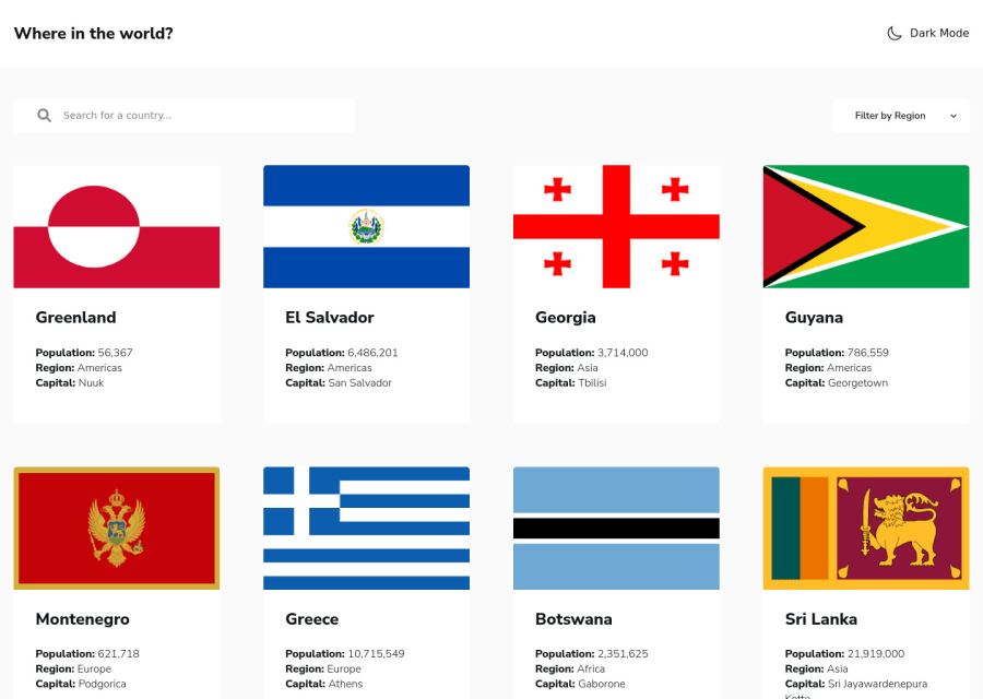
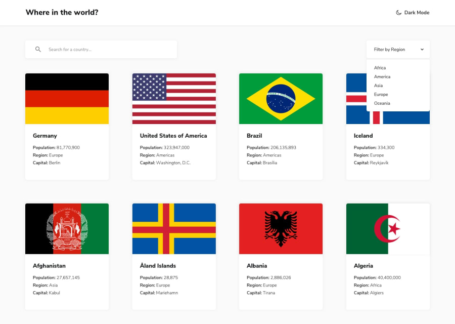
About the UI, I feel a lack of whitespace in mobile view, probably because you stretch the view, instead of having fix card sizes. Also, box shading is missing. Not a big deal though. What I mainly miss is the header in detail view (I cannot switch modes), and the border countries are only labels and not clickable buttons. If you need some visual guidance, check out my solution. There's one thing I was advised of too, from any countries (no matter how far you clicked into neighbors) you should be able to go back to the home page by the click of a button (maybe HOME). Here it is: https://jt1974.github.io/rest-countries/
To sum it up, I really like your code! Congratulations 👏, and if you'd like to work on something bigger in a team, I would be happy to join! 👍
Marked as helpful1@wojtek0123Posted over 2 years ago@JT1974 Thank you for your feedback. I will correct my code. I don't know why I didn't think about header in details page and add links to border countries. It's so obvious. I like your solution more than mine. Also, I'm wondering about to add a custom select tag, so can easily style it.
1
Please log in to post a comment
Log in with GitHubJoin our Discord community
Join thousands of Frontend Mentor community members taking the challenges, sharing resources, helping each other, and chatting about all things front-end!
Join our Discord

