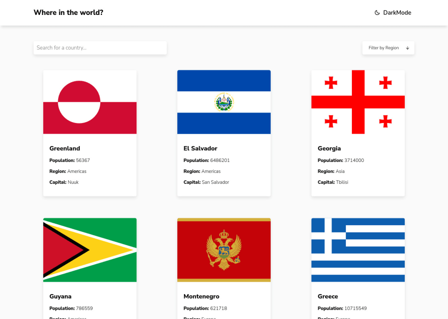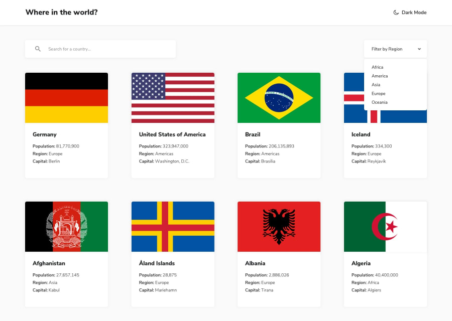
Design comparison
Solution retrospective
My first project with React, i struggled with hooks at the beginning, how can i improve my code? any comments are welcome :)
Community feedback
- @JT1974Posted over 2 years ago
Hey Carlos 👋
Your solution looks perfect! Great job! 👍 I like the white space and the responsiveness too. Even if you struggled with hooks, the app works perfectly and your code is also clean and easy to read.
In case you would like to improve it, you may (or may not) want to consider some of my thoughts:
Tip #1: for such small projects, maybe downloading icons instead of using react-icons can be a good idea to reduce dependencies
Tip #2: also, for only 2 routes, maybe using conditionals instead of the great (tiny) wouter can be another good idea, which may not reduce your bundle size too much, but probably it's easier and good enough for small projects
Tip #3: a stateful header component with dark class added to the body could be an alternative for switching themes, although your solution looks and works perfectly too
Overall, very nice solution, congratulations! 👏
Marked as helpful1
Please log in to post a comment
Log in with GitHubJoin our Discord community
Join thousands of Frontend Mentor community members taking the challenges, sharing resources, helping each other, and chatting about all things front-end!
Join our Discord
