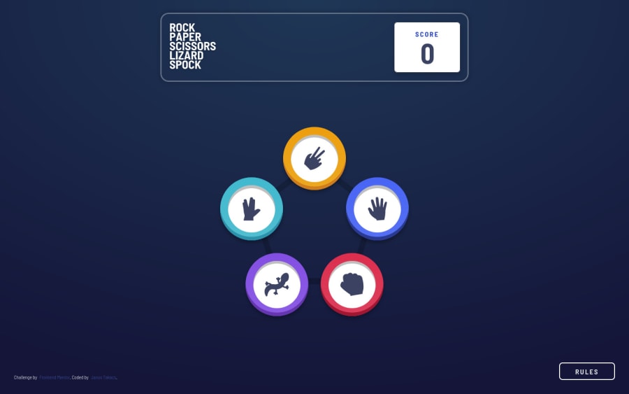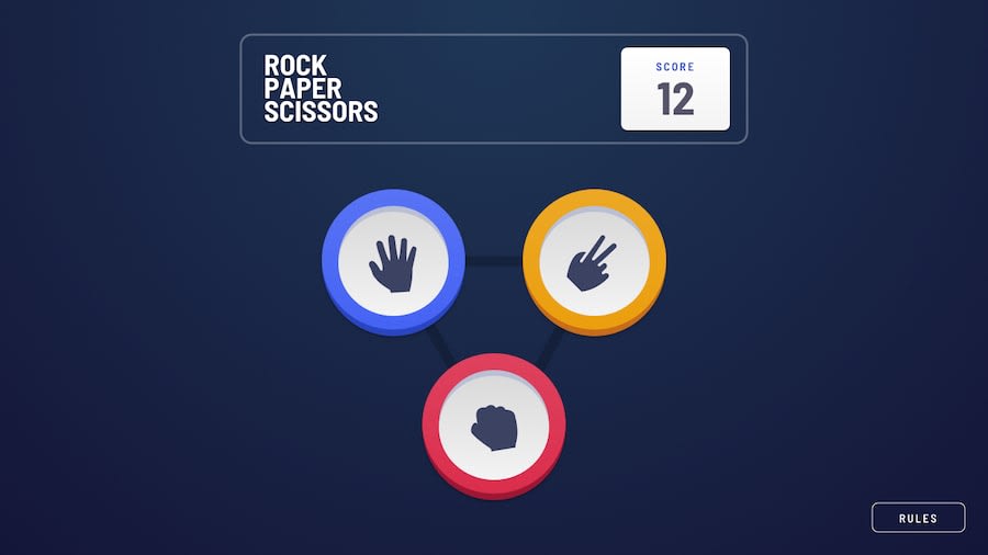
Rock-paper-scissors game built with React styled components
Design comparison
Solution retrospective
What are the best practices to avoid 'path issues' (to static assets in the public folder) when deploying React applications to GitHub pages? I normally use paths, like './images/...' to access images, but after deploying the app from my local computer with 'gh-pages', I could not use these links locally (I had to add the website's name???), but I had to keep them for the Github deployment. Thx
Community feedback
- P@webguy83Posted over 2 years ago
Looks pretty solid overall on my mobile device. Haven't tested it on my desktop yet but great so far and closely resembles the mockups. For a heading to fix the accessibility issue you could probably wrap one around the logo image at the top. Only other thing I would mention is instead of the outer glow around the winner would be to try and create they fading ripple effect from the mockups. Quite a bit more challenging, at least for me it was :D. Also is it not possible to get a tie? I tried over and over haha😂.
Marked as helpful0@JT1974Posted over 2 years ago@webguy83 Hey Curtis! Thanks for reviewing my project and for the helpful comments! I fixed the heading issue. Tie... I did that intentionally 😂 I added 2 lines of extra code to avoid Tie, since it was not on the jpg screenshots (I'm still on the free plan, so I couldn't download Figma mockups). I will add that feature, it was probably a stupid idea..., but good catch! 😜😂 I added the glowing animation around the buttons, due to the same reason (having a free plan), because nothing was visible on the screenshots, and I wanted to have something happening there. I'll look into other solutions to see what you mean, most probably yours, to get an idea about the fading ripple effect (whatever it may mean... 😂). Great review and suggestions, I really appreciate your time! It's a big help, thanks a ton!
0P@webguy83Posted over 2 years ago@JT1974 ooh yeah I also had the free version when I did it. Pretty much had to eyeball the screenshots as best I could. I think I recall the readme file had ties as 0 points earned. Was a fun project to do indeed.
0P@webguy83Posted over 2 years ago@JT1974 ooh yeah I also had the free version when I did it. Pretty much had to eyeball the screenshots as best I could. I think I recall the readme file had ties as 0 points earned. Was a fun project to do indeed.
0P@webguy83Posted over 2 years ago@JT1974 ooh yeah I also had the free version when I did it. Pretty much had to eyeball the screenshots as best I could. I think I recall the readme file had ties as 0 points earned. Was a fun project to do indeed.
0@JT1974Posted over 2 years ago@webguy83 I don't remember tie, although I read it 3 days ago, but I'm old, so... 🤣 Thanks Curtis!
0@JT1974Posted over 2 years ago@JT1974 I reviewed your solution, and man, that's really awesome! Congrats! Now I know what you meant in your review! I thought those circles around the winner's button is due to the optimization of the jpg image, and it meant to be a glowing effect... 🤣 I also liked that you put a delay and animation to show the computer's hand and who the winner is, that's a lot more interesting than my immediate response. Nice work!
0@JT1974Posted over 2 years ago@JT1974 finally deployed the changes to GitHub Pages. Looks a lot better.
0
Please log in to post a comment
Log in with GitHubJoin our Discord community
Join thousands of Frontend Mentor community members taking the challenges, sharing resources, helping each other, and chatting about all things front-end!
Join our Discord
