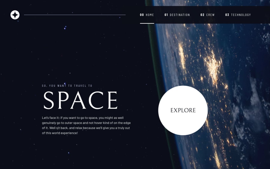
Design comparison
Solution retrospective
Hi there.👋 I have completed the space tourism website challenge with help of scrimba course & Kevin Powell.
I have learned a lot of things. & It is my first multipage website. So it was tough for me.
Feel free to give suggestions & feedback. I will be happy if you help to improve
Community feedback
- @JT1974Posted over 2 years ago
Hey Prantik 👋
Nice solution, congratulations! 👏
I have a few ideas how you could further improve your code to make your site look even better.
On mobile, the EXPLORE button is quite big, actually it takes up approx. 40% of the height of the screen. Even though it's a CTA, it might be a little smaller to create some whitespace.
The same goes for the planet's name, the typography there doesn't follow the design (it's 100px in mobile, 80px in tablet, then again 100px in desktop view). EUROPA doesn't even fit to the screen. You can set the font-size, along with white-space and other properties with media queries.
I'm not sure why, but the layout changes at 560px, and right after that, at 560px the tablet view kicks in. At this width, there's no white space in case of the Technology heading and hardly any in case of the other pages. And to change to desktop view at 720px is definitely too early, because it doesn't fit to the screen.
These are smaller and easy to fix issues, that could be fixed by adding a few more utility classes (I see that you like that).
Overall, it's a nice website, that you can be proud of, so keep up the good work! 👍🙂
Marked as helpful0
Please log in to post a comment
Log in with GitHubJoin our Discord community
Join thousands of Frontend Mentor community members taking the challenges, sharing resources, helping each other, and chatting about all things front-end!
Join our Discord