Skip to content
Learning paths
Challenges
Solutions
Articles
Unlock Pro
Log in with GitHub
Profile
Overview
Solutions
15
Comments
0
Feithers
@Feithers
Follow
All solutions
Submitted over 1 year ago
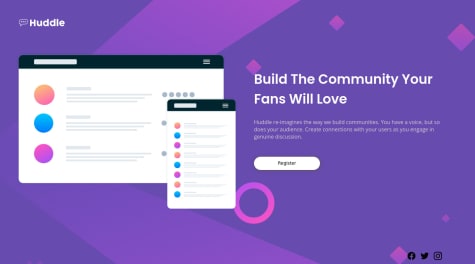
Challenge using HTML and CSS
HTML
CSS
0
4
0
Submitted over 1 year ago
Challenge using HTML and CSS, both for mobile and desktop!
HTML
CSS
0
4
0
Submitted over 1 year ago
Challenge using CSS and HTML!
HTML
CSS
0
3
0
Submitted over 1 year ago
Challenge using HTML and CSS, both mobile and desktop!
HTML
CSS
0
3
0
Submitted over 1 year ago
Solution using CSS and HTML!
HTML
CSS
1
3
0
Submitted over 1 year ago
Challenge using CSS and HTML, I have some questions plz!
HTML
CSS
1
2
1
Submitted over 1 year ago
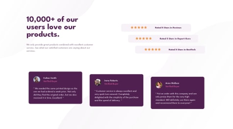
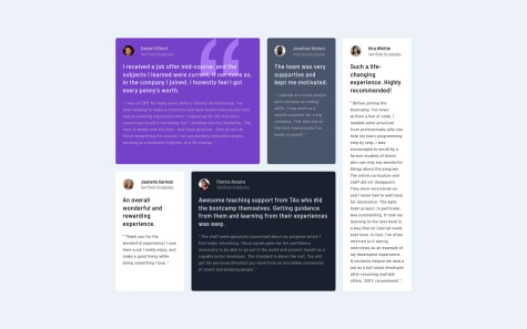
Testimonials Challenge using CSS and HTML. Have some questions!!
HTML
CSS
2
3
0
Submitted over 1 year ago
Profile card solution using HTML and CSS
HTML
CSS
2
4
0
Submitted over 1 year ago
Preview Card solution using HTML and CSS.
HTML
CSS
0
4
0
Submitted over 1 year ago
Help!! Challenge #6 with CSS and HTML
HTML
CSS
1
3
0
Submitted over 1 year ago
Challenge n° 5 with HTML and CSS
HTML
CSS
0
3
0
Submitted over 1 year ago
My challenge #4 using CSS and HTML
HTML
CSS
0
3
0
Submitted over 1 year ago
Solution using HTML and CSS only. Any help apreciated!
HTML
CSS
0
3
0
Submitted over 1 year ago
Second Challenge, using HTML and CSS only. Fixed some stuff
HTML
CSS
2
5
0
Submitted over 1 year ago
Desktop second solution using CSS and HTML
HTML
CSS
2
4
0
