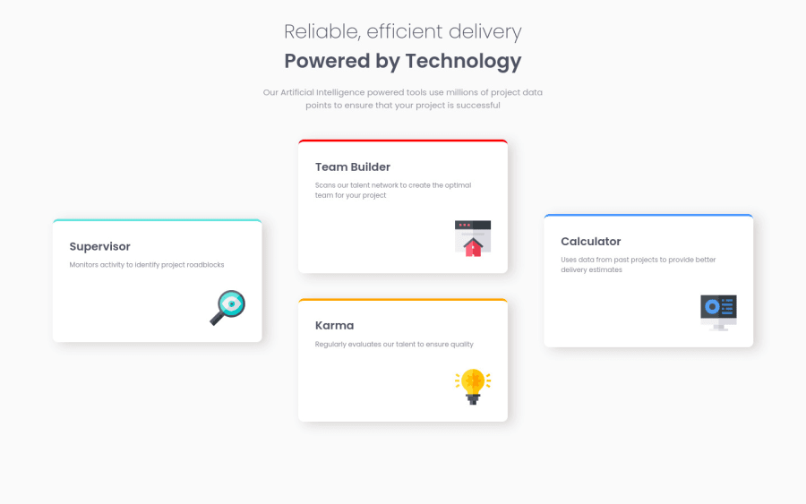
Challenge using HTML and CSS, both mobile and desktop!


Design comparison

Solution retrospective
Hello there!
This time I tried to make it good for both mobile and desktop, and I think I did a decent job, however if you see any unnecessary code or something that you think would have made things better, I'm glad to hear!
I do have 2 specific questions though, which I think there should be a better way that I'm not aware of:
1- For the text that's just below <h1>, the "Our artificial intelligence..." I had to separate it into two <p>'s, because I wanted it to be centered but within 2 rows or lines, and when I used "text-align" to center it, it just was one long row/line, so my question is: Is there any better way to do what I wanted?
2- For the <h1> I had to use a media query to change the font size on smaller screens. Is there any property that makes the font-size responsive? I thought about vh and vw, but on smaller screens it's too small.
Thanks!!
Community feedback
Please log in to post a comment
Log in with GitHub
Join our Discord community
Join thousands of Frontend Mentor community members taking the challenges, sharing resources, helping each other, and chatting about all things front-end!
Join our Discord