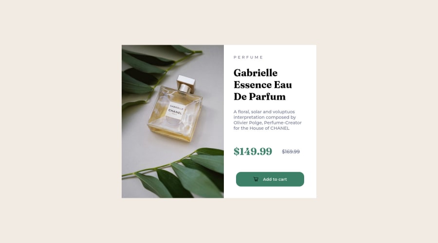
Second Challenge, using HTML and CSS only. Fixed some stuff
Design comparison
Solution retrospective
Hello! This is the second challenge I've done so far. This time around I think I got it pretty good. Maybe there's some stuff on the code that can be made in simpler ways, and that's probably the advice that I would like to know so I can learn for the next one. Thanks! *This is the update, I've fixed some stuff!
Community feedback
- @MelvinAguilarPosted over 1 year ago
Hello there 👋. Good job on completing the challenge !
I have some suggestions about your code that might interest you.
HTML 🏷️:
-
Avoid using uppercase text in your HTML because screen readers will read it letter by letter. You can use the
text-transformproperty to transform the text to uppercase in CSS.The word "perfume" is written as separate letters, which does not convey the meaning that this text is a single cohesive unit of content. This can be confusing for users and for screen readers, as it can be difficult to understand the meaning of the text.
Example:
<p>Perfume</p>

p {
    text-transform: uppercase;
    letter-spacing: 0.3em;
}
- The
altattribute should not contain the words "image", "photo", or "picture", because the image tag already conveys that information.
-
Not all images should have alt text. The cart-icon is a decorative image, it does not add any information to the page. You should use an empty
altattribute instead of a descriptive one. You can read more about this here 📘.If you want to learn more about the
altattribute, you can read this article. 📘.
I hope you find it useful! 😄
Happy coding!
Marked as helpful0 -
- @0xabdulkhaliqPosted over 1 year ago
Hello there 👋. Congratulations on successfully completing your first challenge! 🎉
- I have other recommendations regarding your code that I believe will be of great interest to you.
HTML 🏷️:
<html>element must have a lang attribute with valid value, so fix it by<html lang="en">
CSS 🏷️:
.main { display: flex; justify-content: center; margin-top: 12rem; }- Instead try this,
.main { display: grid; place-items: center; min-height: 100vh; }- This css snippet will helps your component to be placed at center of the screen dynamically without any
marginorpadding
I hope you find it useful! 😄 Above all, the solution you submitted is great!
Happy coding!
0@FeithersPosted over 1 year ago@0xAbdulKhalid What does the min-height property exactly do? And what measurement is vh? Thanks, I'll try all that!
0@0xabdulkhaliqPosted over 1 year ago@Feithers
min-heightproperty:- We want to use
min-height: 100vhinstead ofheight: 100vh. - Setting the height to
100vhmay result in the component being cut off on smaller screens, such as a mobile phone in landscape orientation. - This why we prefer to use
min-heightinstead ofheight
vhproperty:- The full form of vh is viewport height.
- It works like the percentage unit as well. Specifying
10vhis equivalent to occupying10%of entire visible screen height. - If you look carefully, you can see that
50vhmeans50%, which will cover half of the entire screen height.
Hope this reply will be helpful for you
Feel free to reach me if you have any queries
Marked as helpful0
Please log in to post a comment
Log in with GitHubJoin our Discord community
Join thousands of Frontend Mentor community members taking the challenges, sharing resources, helping each other, and chatting about all things front-end!
Join our Discord
