Riki Wendri
@F4YYAll comments
- @yashh247Submitted over 1 year ago@F4YYPosted over 1 year ago
Hi @yashh247,
Congratulation for successfully completing the challenge...
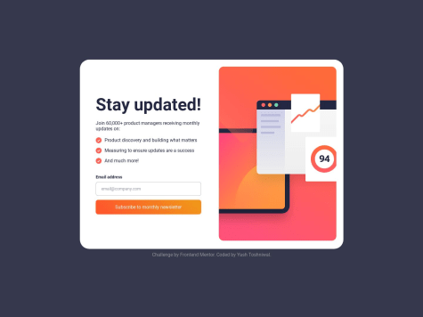
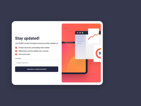
There's little suggestion about what you've missed to the given design. Which is when user submits their email address through the form and clicked subscribe button, then the Thank You component will be rendered, displaying the thank you message along with the
user's email addressthat has been inputted instead of just static text@loremcompany.com.To achieve the desired behavior, you might need to add JavaScript function, so that the
inputted email addressis dynamically inserted into the thank you message.Hope that could be Helpful. Above all you did very good. Keep happy coding...
0 - @KeoLamolaSubmitted over 1 year ago
Hi All, any for of a feedback towards my solution is highly appreciated.
@F4YYPosted over 1 year agoHi @OekPhlesym,
Congratulations on successfully completing the challenge, you did very well...
There is improvement room to make it closer to the given design. Which is appearance of the
eye iconoverlaying above the equilibrium image when hovering. You can set overlay component and make its absolute position, also set relative position of the image container.Then insert it in HTML & CSS, the code snippet could be like this, you might adjust it as you like:
in HTML:
<div class="avatar">
    <img src="images/image-equilibrium.jpg" alt="preview">
    <img src="images/icon-view.svg" class="overlay" />
</div>
in CSS:
.avatar {
   display: flex;
   position: relative;
   justify-content: center;
   align-items: center;
   height: 60%;
   width: 100%;
}
.overlay{
   position: absolute;
   top: 0;
   left: 0;
   right: 0;
   bottom: 0;
   opacity: 0;
}
.overlay: hover{
   opacity: 1;
   background: hsl(178, 100%, 50%, 0.5);
}
Hope that could be Helpful. Keep happy coding...
0 - @ArinjayBholaSubmitted over 1 year ago@F4YYPosted over 1 year ago
Hi @ArinjayBhola,
Congratulation for successfully completing your 1st challenge, you did great...
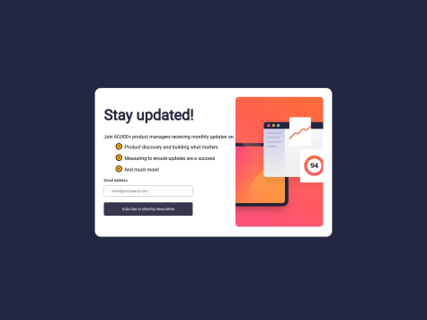
Little suggestion to make it closer to the given design, which is when user submits their email address through the form and clicked subscribe button, then the Thank You / Success component will be rendered, displaying the thank you message along with the
user's email addressthat has been inputted instead of just static text[email protected].To achieve the desired behavior, you might need to add JavaScript function, so that the
inputted email addressis dynamically inserted into the thank you message.Hope that could be Helpful. Keep happy coding...
0 - @peipeix2Submitted over 1 year ago
Any feedback is welcomed! :-)
@F4YYPosted over 1 year agoHi @peipeix2,
Congratulation for successfully completing the challenge, nicely done...
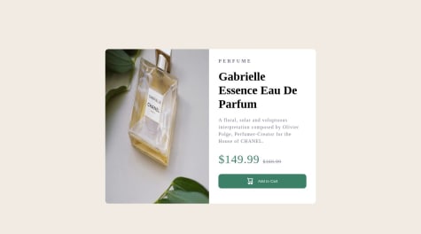
However, when on mobile screen view the image's not showing. In your code, the src attribute for the mobile screen size is specified as
src="../images/image-product-mobile.jpg". The use of the..in the path indicates that the image file is located in a directory one level above the current directory.Try using
src="./images/image-product-mobile.jpg"is the way to specify the relative path to the image file when it is located in the images folder directory within the same directory as the HTML file. By using this path, the browser will display theimage-product-mobile.jpg.Hope that could be Helpful. Keep happy coding...
Marked as helpful0 - @rgapSubmitted over 1 year ago@F4YYPosted over 1 year ago
Hi @rgap,
Congratulation for successfully completing your challenge, you did very well...
Based on the CSS code you provided, it seems that the width of the
.boxelement is set to 20%. This means that the width of the.boxelement will be 20% of its parent container's width. When displaying on a mobile screen, it can cause the.boxelement to shrink and the text within it to overflow. This can result in the text not fitting within the container and appearing outside of it.To fix this issue, you might consider using media queries to adjust the width of the .box element for different screen sizes. Such like CSS code snippet below:
@media (max-width: 480px) {
    .box {
        width: 80%; /* Adjust the width as per your requirement */
    }
}
You can customize the styles for different screen sizes and ensure that the text fits within its parent container without overflowing.
Hope that could be Helpful. Keep happy coding...
0 - @HatemGwSubmitted over 1 year ago
could you give me your review it'll be helpful
@F4YYPosted over 1 year agoHi @HatemGw,
Congratulation for successfully completing the challenge...
There's suggestion to make it closer to the given design, which is when user submits their email address through the form and clicked subscribe button, then the Thank You / Success component will be rendered, displaying the thank you message along with the
user's email addressthat has been inputted instead of just static text[email protected].To achieve the desired behavior, you might need to add JavaScript function, so that the inputted email address is dynamically inserted into the thank you message.
Hope that could be Helpful. Above all you did great. Keep happy coding...
Marked as helpful0 - @yzhuuuuSubmitted over 1 year ago
how to adjust image size is kinda difficult
@F4YYPosted over 1 year agoHi @yzhuuuu,
Congratulation for successfully completing the challenge...
In your provided code, it seems that you're using
min-widthfor the mobile image andmax-widthfor the desktop image. To clarify:The
min-widthmedia query is used to specify styles for screen widths equal to or greater than the specified value. Themax-widthmedia query is used to specify styles for screen widths less than or equal to the specified value.If you're aiming to show the mobile image for smaller screens and the desktop image for larger screens, you might want to adjust your media queries accordingly. For instance:
-> Show mobile image for screens up to 600px wide:
@media (max-width: 600px) {
  .img-container img {
    display: block;
    max-width: 100%;
    height: auto;
  }
}
-> to show desktop image for screens 601px and wider: @media (min-width: 601px) { .img-container img { display: block; max-width: 100%; height: auto; } }Hope that could be helpful. Keep happy coding...
0 - @margsoftbfSubmitted over 1 year ago
Another solution, next will be project in React and start training on that.
@F4YYPosted over 1 year agoHi @margsoftbf,
Congratulation for successfully completing the challenge...
There're suggestions to make it closer to the given design.
- When user submits their email address through the form and clicked subscribe button, then the Thank You / Success component will be rendered, displaying the thank you message along with the
user's email addressthat has been inputted instead of just static text[email protected]. To achieve the desired behavior, you might need to add JavaScript function, so that the inputted email address is dynamically inserted into the thank you message. - Add property with
justify-content: center; andalign-items: center; will horizontally and vertically center the content within the <body> element.
Hope that could be Helpful. Above all you did great. Keep happy coding...
Marked as helpful0 - When user submits their email address through the form and clicked subscribe button, then the Thank You / Success component will be rendered, displaying the thank you message along with the
- @a3mxnSubmitted over 1 year ago@F4YYPosted over 1 year ago
Hi @a3mxn,
Congratulation for completing the challenge...
From user point of view, I have few suggestions that might interest you to fit app as close as to given design.
- Adaptive when it comes to mobile screen view, at about pixel width less than
480pxwhich is commonly used as a breakpoint for mobile screens. Inside the media query, you might need adjusted the flex-direction tocolumn-reverseand set the height toauto, allowing the content to stack vertically on smaller screens. This will help ensure a more responsive layout on mobile devices. Such CSS snippet below:
@media (max-width: 480px) { .container { flex-direction: column-reverse; height: auto; } }- Blend the color of an image; you might use the mix-blend-mode property to blend the color of an image with its background using the multiply mode. It multiplies the color of the image with the color of the background(purple), resulting in a darker blend.
Hope those could pretty much Helpful. Above all you did very great. Keep happy coding...
0 - Adaptive when it comes to mobile screen view, at about pixel width less than
- @pajarmuharam14Submitted over 1 year ago@F4YYPosted over 1 year ago
Hi @pajarmuharam14,
Congratulation for successfully completing the challenge...you did very well.
However, there is recommendation to optimize screen view especially for mobile devices. For devices with varying screen sizes, there are a few common breakpoints:
- Mobile Devices – 320px — 480px
- iPads and Tablets – 481px — 768px
- Laptops and small screen – 769px — 1024px
- Large screens and Desktops – 1025px — 1200px
- TV and Extra Large Screens – 1201px and more
Since you set
@media (max-width:375px)for mobile screen view, it will cause other mobile devices width more than that (such as iphone 12, iphone XR, iphone 6/7/8 plus, etc) are displaying same as desktop screen, flow-direction is row (by default) instead of flex-direction: column. To resolve this issue you may replace with@media (max-width:480px).Hope that could be Helpful. keep happy coding...
Marked as helpful0 - @myj009Submitted over 1 year ago@F4YYPosted over 1 year ago
Hi @myj009,
Congratulation for successfully completing the challenge...
There's little suggestion about what you've missed to the given design. Which is when user submits their email address through the form and clicked subscribe button, then the Thank You component will be rendered, displaying the thank you message along with the
user's email addressthat has been inputted instead of just static text<span class="font-bold">to your email address</span>.To achieve the desired behavior, you might need to add JavaScript function, so that the inputted email address is dynamically inserted into the thank you message.
Hope that could be Helpful. Above all you did very good. Keep happy coding...
Marked as helpful0 - @ribeiroLeviSubmitted over 1 year ago
This was the first time that i aplied some js to a project and i coudn't figure out how do change the email in the second screen, can any one help me?
@F4YYPosted over 1 year agoHi @ribeiroLevi,
Congratulation for successfully completing the challenge, nicely done...
To displaying the second screen thank you message along with the
user's email addressthat has been inputted instead of just static textTESTE, you might need to add JavaScript function, so it will dynamically be inserted into the thank you message.If you're using react frameworks, it quite simple send user input email address value as props to it. Such like sample snippet below:
<p>
  A confirmation email has been sent to `{props.value}`. Please open
  it and click the button inside to confirm your subscription.
</p>
Hope that could be Helpful. Keep happy coding...
0
