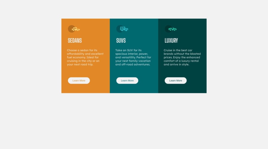


Design comparison

Community feedback
- @F4YYPosted over 1 year ago
Hi @pajarmuharam14,
Congratulation for successfully completing the challenge...you did very well.
However, there is recommendation to optimize screen view especially for mobile devices. For devices with varying screen sizes, there are a few common breakpoints:
- Mobile Devices – 320px — 480px
- iPads and Tablets – 481px — 768px
- Laptops and small screen – 769px — 1024px
- Large screens and Desktops – 1025px — 1200px
- TV and Extra Large Screens – 1201px and more
Since you set
@media (max-width:375px)for mobile screen view, it will cause other mobile devices width more than that (such as iphone 12, iphone XR, iphone 6/7/8 plus, etc) are displaying same as desktop screen, flow-direction is row (by default) instead of flex-direction: column. To resolve this issue you may replace with@media (max-width:480px).Hope that could be Helpful. keep happy coding...
Marked as helpful0

Please log in to post a comment
Log in with GitHub
Join our Discord community
Join thousands of Frontend Mentor community members taking the challenges, sharing resources, helping each other, and chatting about all things front-end!
Join our Discord