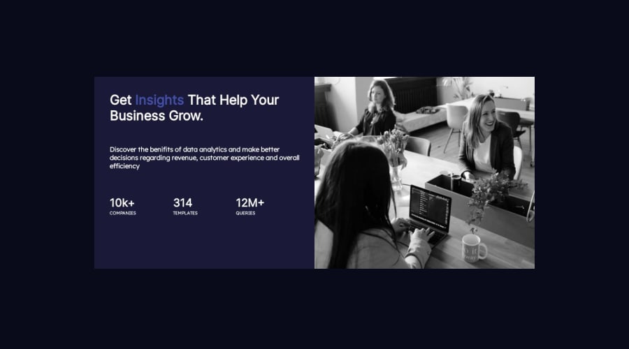


Design comparison
SolutionDesign

Community feedback
- @F4YYPosted over 1 year ago
Hi @a3mxn,
Congratulation for completing the challenge...
From user point of view, I have few suggestions that might interest you to fit app as close as to given design.
- Adaptive when it comes to mobile screen view, at about pixel width less than
480pxwhich is commonly used as a breakpoint for mobile screens. Inside the media query, you might need adjusted the flex-direction tocolumn-reverseand set the height toauto, allowing the content to stack vertically on smaller screens. This will help ensure a more responsive layout on mobile devices. Such CSS snippet below:
@media (max-width: 480px) { .container { flex-direction: column-reverse; height: auto; } }- Blend the color of an image; you might use the mix-blend-mode property to blend the color of an image with its background using the multiply mode. It multiplies the color of the image with the color of the background(purple), resulting in a darker blend.
Hope those could pretty much Helpful. Above all you did very great. Keep happy coding...
0 - Adaptive when it comes to mobile screen view, at about pixel width less than

Please log in to post a comment
Log in with GitHub
Join our Discord community
Join thousands of Frontend Mentor community members taking the challenges, sharing resources, helping each other, and chatting about all things front-end!
Join our Discord