Design comparison
Community feedback
- @F4YYPosted over 1 year ago
Hi @rgap,
Congratulation for successfully completing your challenge, you did very well...
Based on the CSS code you provided, it seems that the width of the
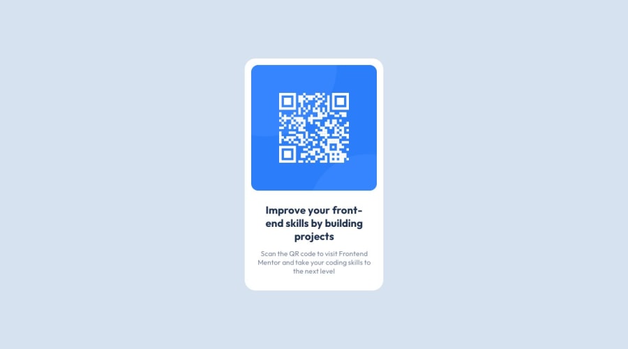
.boxelement is set to 20%. This means that the width of the.boxelement will be 20% of its parent container's width. When displaying on a mobile screen, it can cause the.boxelement to shrink and the text within it to overflow. This can result in the text not fitting within the container and appearing outside of it.To fix this issue, you might consider using media queries to adjust the width of the .box element for different screen sizes. Such like CSS code snippet below:
@media (max-width: 480px) {
    .box {
        width: 80%; /* Adjust the width as per your requirement */
    }
}
You can customize the styles for different screen sizes and ensure that the text fits within its parent container without overflowing.
Hope that could be Helpful. Keep happy coding...
0
Please log in to post a comment
Log in with GitHubJoin our Discord community
Join thousands of Frontend Mentor community members taking the challenges, sharing resources, helping each other, and chatting about all things front-end!
Join our Discord
