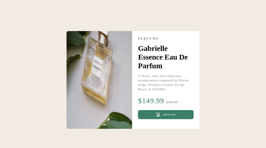


Design comparison

Solution retrospective
how to adjust image size is kinda difficult
Community feedback
- @F4YYPosted over 1 year ago
Hi @yzhuuuu,
Congratulation for successfully completing the challenge...
In your provided code, it seems that you're using
min-widthfor the mobile image andmax-widthfor the desktop image. To clarify:The
min-widthmedia query is used to specify styles for screen widths equal to or greater than the specified value. Themax-widthmedia query is used to specify styles for screen widths less than or equal to the specified value.If you're aiming to show the mobile image for smaller screens and the desktop image for larger screens, you might want to adjust your media queries accordingly. For instance:
-> Show mobile image for screens up to 600px wide:
@media (max-width: 600px) {
  .img-container img {
    display: block;
    max-width: 100%;
    height: auto;
  }
}
-> to show desktop image for screens 601px and wider: @media (min-width: 601px) { .img-container img { display: block; max-width: 100%; height: auto; } }Hope that could be helpful. Keep happy coding...
0

Please log in to post a comment
Log in with GitHub
Join our Discord community
Join thousands of Frontend Mentor community members taking the challenges, sharing resources, helping each other, and chatting about all things front-end!
Join our Discord