Not Found
Not Found
Not Found
Not Found
Not Found
Not Found
Not Found
Not Found
Not Found
Not Found
Not Found
Not Found
Not Found
Not Found
Not Found
Not Found
Not Found
Not Found
Not Found
Not Found

All comments

  • @habc0d3r

    Submitted

    I found it difficult to match the font size of the paragraph as the original one.

    @Danish49

    Posted

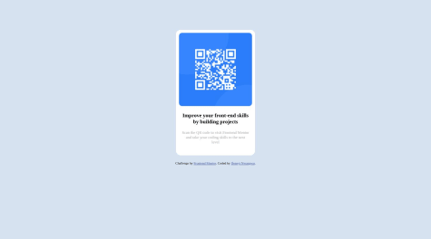
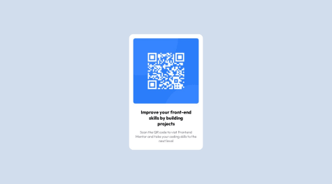
    Your Code may have accessibility issues as there is less use of semantic markup. You could have used a main tag instead of a div container , also there is one line of code unused <div class="qr-code"></div>. image can be directly placed in the main tag and text elements in a separate div. code needs optimization but the design is looking good much close to the original version. keep coding and congratulations on completing your first challenge.

    Marked as helpful

    1
  • @Danish49

    Posted

    This comment was deleted

    0
  • @Danish49

    Posted

    Text-align : centre;

    0
  • @Danish49

    Posted

    Its not a best practice to keep every single element in a separate div rather we should follow the semantic markup for accessibility and better performance, You could have used a main tag instead of using div image can be directly placed in the main tag and text elements in a separate div and that all the required code for this challenge. Congratulations for completing your first challenge keep coding 👍🏻

    0
  • @Danish49

    Posted

    Instead of using repeated divs you could have used a main tag for better accessibility and semantic markup you can keep the image directly in the main tag and text elements in a separate div and thats it no need of keeping everything in a separate div.

    0
  • @Danish49

    Posted

    Nice design and nicely coded keep it up.

    0
  • @Danish49

    Posted

    This comment was deleted

    0
  • @Danish49

    Posted

    Works well but you should change the background colour and set the height of the body to 720px as most laptops come with 720px viewport height. This will make your design look much nicer but coming to javascript thats nicely implemented very impressive 👍🏻

    Marked as helpful

    0
  • @Terminal239

    Submitted

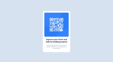
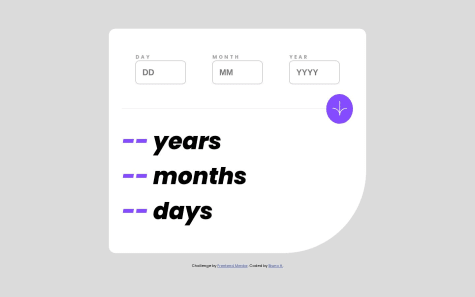
    Please share feedback on the code structure and design layout and how I could improve things.

    Also, am using the rem units for the padding and margin because it helps things on the response side and keeps things clean. This is a controversial choice and after much research on px vs rem, I settled on rem when I found that Kevin Powell, one of the leading CSS professionals, goes for rem as well.

    @Danish49

    Posted

    This is perfect set the height of the body ko 720px because this is the viewport height of various laptops it will make the design more accurate. Code is also properly structured well done 👍🏻. Keep it up smart coder.

    Marked as helpful

    0
  • @Guilherme-Luis

    Submitted

    So, it gets confusing when defining the shading on the main element, it seems that shading is used, but at the same time it seems that it is not.

    Responsive and references

    #accessibility#materialize-css

    2

    @Danish49

    Posted

    There os no use of box shadow you have set a different background colour that's why it seems to you that there is a shade in the original version.

    0
  • @Danish49

    Posted

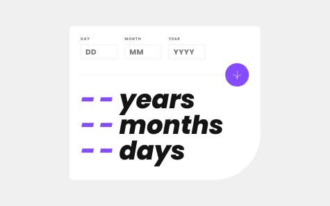
    Till now i haven't seen any design that is properly sized like this so nice 👍🏻 But one this is there which needs attention its the width of text elements

    Marked as helpful

    2
  • @Danish49

    Posted

    I have a suggestion regarding your code. Instead of using a container div use a main tag for accessibility and semantic markup. You can place the image directly in the main tag and text elements in a separate div.

    By the way your Design looks great keep it up

    0
  • @Lucas198821

    Submitted

    Exercise Details

    In general ranges, perhaps what was most difficult for me was to center everything in the main container, then the issue of the measurements of the card I don't know if they are like those indicated in the challenge.

    Do you have any questions about best practices? yes, would it have been wrong to use position Absolute ?

    @Danish49

    Posted

    My dear instead of using a container div use a main tag for accessibility and semantics. And Using position absolute will cause you error keep in mind position absolute removes the element from the normal flow of the document. In this challenge there is no use of position for aligning content in centre we should either use flexbox or grid. Another way to centre an element is by using margin auto which works when the parent container has full width and height and a block display. Congratulations for completing your first challenge keep coding.

    0
  • @SaeM843

    Submitted

    Hi there, I’m Sae and this is my solution for this challenge👋

    Any feedback on how I can improve code are more than welcome!

    Thank you.

    @Danish49

    Posted

    Replace the div class card with a main tag for accessibility and semantics and pay a little attention towards the font color and size of the design. Rest is nice 👍🏻 congratulations for completing your first challenge keep coding.

    0
  • @Danish49

    Posted

    Friend I have a suggestion instead of using a div container try using a main tag for accessibility and semantics. Keep the image directly in the main tag and text elements in a separate div. Keep coding & congratulations for your first challenge.

    0
  • @capnsmitty

    Submitted

    • What are some best practices when using @media for different displays?
    • For text size is it more common to use px values or use relative units such as em/rem?

    @Danish49

    Posted

    using pixels is not a best practice dear, rather use rem or em units. when using media queries always decrease the font size of HTML when moving from a large screen to a smaller screen.

    @media(max-width:1024px){ html{ fontsize:62.5%; } }

    @media(max-width:768px){ html{ fontsize:55%; } }

    @media(max-width:549px){ html{ fontsize:50%; } }

    This way the root font size will get decreased when the viewport hits these breakpoints, the breakpoints i used in above code are for example only.

    Marked as helpful

    1
  • @Danish49

    Posted

    My dear friend for better accessibility and to follow the semantic markup you could replace the div.box with a main tag and keep text elements in a separate div and image element directly in the main tag. Also you should pay some attention to size of the design. Rest is good 👍🏻 keep it up.

    0
  • @Danish49

    Posted

    Always Follow best practices instead of using a container div a main tag is preferable and no need of nesting multiple divs.

    Put the image directly in the main tag and text elements in a separate div. And set height properly if 100% doesn't work then try setting 720px as most of the laptops come with 720px viewport height.

    0
  • @Danish49

    Posted

    Your code is properly structured but instead of an article tag using a main tag would be a wise choice for accessibility.

    Marked as helpful

    1
  • @Danish49

    Posted

    You could use a main tag instead of a div container for more accessibility, And pay attention to the size of the design overall your design looks great 👍🏻 keep coding.

    0
  • @Danish49

    Posted

    I feel there might be no need of a enclosing all elements in a section you could have kept the image in the main tag alone and text elements in a div , design is slightly bigger pay attention to it But above all your design looks great 👍🏻 Keep coding

    Marked as helpful

    1
  • @Danish49

    Posted

    You could replace the container div with a main tag for more accessible code and semantics.

    Also font colour needs attention, design looks perfectly aligned and sized keep coding 👍🏻

    0
  • @Danish49

    Posted

    Its working fine , but you could have set the height of the container properly if 100% doesn't work then you can try 720px which is the viewport height of various laptops. Fonts also need some attention.

    Marked as helpful

    0
  • @Danish49

    Posted

    Congratulations for completing your first challenge. Very impressive

    0