Design comparison
SolutionDesign
Community feedback
- @Danish49Posted over 1 year ago
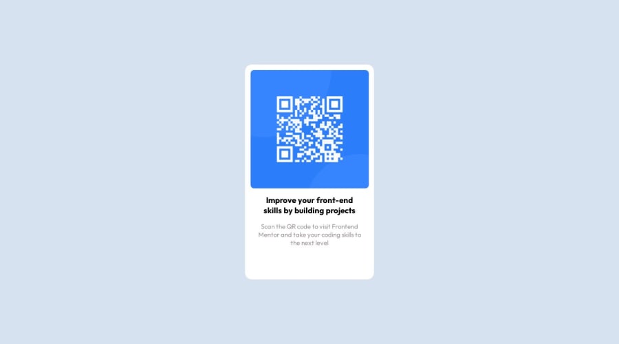
I have a suggestion regarding your code. Instead of using a container div use a main tag for accessibility and semantic markup. You can place the image directly in the main tag and text elements in a separate div.
By the way your Design looks great keep it up
0
Please log in to post a comment
Log in with GitHubJoin our Discord community
Join thousands of Frontend Mentor community members taking the challenges, sharing resources, helping each other, and chatting about all things front-end!
Join our Discord
