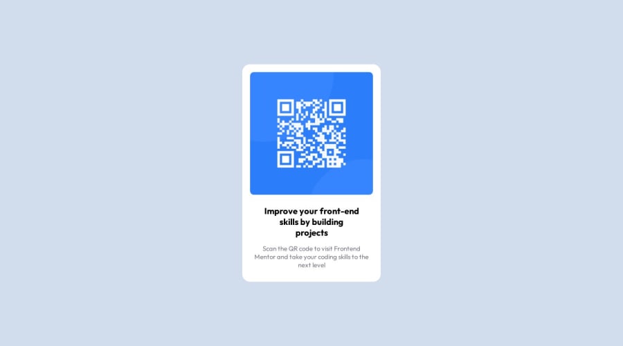
Design comparison
SolutionDesign
Community feedback
- @Danish49Posted over 1 year ago
Till now i haven't seen any design that is properly sized like this so nice 👍🏻 But one this is there which needs attention its the width of text elements
Marked as helpful2 - @0xabdulkhaliqPosted over 1 year ago
Hello there 👋. Congratulations on successfully completing the challenge! 🎉
- I have other recommendations regarding your code that I believe will be of great interest to you.
CSS 🎨:
- Let me explain, How you can easily center the component for better layout without usage of
absolutepositioning.
- We don't need to use
absoluteto center the component both horizontally & vertically. Because usingabsolutewill not dynamical centers our component at all states
- To properly center the component in the page, you should use
FlexboxorGridlayout. You can read more about centering in CSS here 📚.
- For this demonstration we use css
Gridto center the component
body { min-height: 100vh; display: grid; place-items: center; }- Now remove these styles, after removing you can able to see the changes
.qr-code-block {
position: absolute;
top: 50%;
transform: translateY(-50%);
left: 0;
right: 0;
margin: auto;
}
- Now your component has been properly centered.
.
I hope you find this helpful 😄 Above all, the solution you submitted is great !
Happy coding!
Marked as helpful1 - @Kamlesh0007Posted over 1 year ago
.qr-code-block strong
{
display: block;
color: black;
margin: 20px 0 15px;
/* padding: 0 20px; */ remove this
font-size: 20px;
}
remove the padding so the text will match the design and add this also
.qr-code-block figcaption
{
color: #797b87;
padding: 0px 8px;
}
1
Please log in to post a comment
Log in with GitHubJoin our Discord community
Join thousands of Frontend Mentor community members taking the challenges, sharing resources, helping each other, and chatting about all things front-end!
Join our Discord
