
P
Carson Haskell
@Carson-HaskellAll solutions
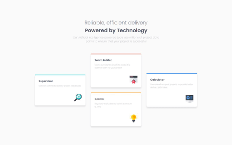
Responsive Four Card Feature
PSubmitted 8 months agoCSS Grid, haha. I'm sure someone better than me would like at my code and see so many dumb decisions. And, I know there is a way to do it without media queries but I couldn't figure it out.
Responsive Recipe Card using CSS media queries
PSubmitted 9 months agoEven though I don't like the way it looks so I went another route, I do want to know: what is the best way to implement the correct styling for the image for the mobile layout (fixed to the top, full width)?
Blog Preview Card
PSubmitted 9 months agoI could not figure out how to dynamically change font-size without using media queries. I normally use TailwindCSS, which makes something like that a piece of cake. Couldn't figure out how (and I don't know why you would even do it without media queries) so I just ended up using media queries. Would be curious to hear the solution though!