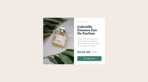
Responsive Product Preview Card

Solution retrospective
Getting the dynamic picture imports working and styled.
What challenges did you encounter, and how did you overcome them?the card component has a border-radius, but the image was covering the border-radius (because it's square, obv.). At first, I tried to apply border-top-left and border-bottom-left to the img, which worked fine, until I checked the mobile layout and realized the position of the image changes (in mobile, top-left and top-right need radius). I could have just used a media query to override border-bottom-left and set border-top-right instead, but, my spidey-senses were tingling and I knew there had to be a better way. This is 2024 afterall, we don't need to be that verbose with our CSS, right?
Sure enough, a quick google search revealed that all I needed to do was apply overflow: hidden to the card container, and boom - just like that, the problem was solved.
So, this:
picture img {
  /* ... */
  border-top-left-radius: 10px;
  border-bottom-left-radius: 10px;
}

@media (max-width: 768px) {
  /* ... */
  border-bottom-left-radius: none;
  border-top-right-radius: 10px;
}
became this:
.card {
  /* ... */
  overflow: hidden;
}
Please log in to post a comment
Log in with GitHubCommunity feedback
No feedback yet. Be the first to give feedback on Carson Haskell's solution.
Join our Discord community
Join thousands of Frontend Mentor community members taking the challenges, sharing resources, helping each other, and chatting about all things front-end!
Join our Discord