Not Found
Not Found
Not Found
Not Found
Not Found
Not Found
Not Found
Not Found
Not Found
Not Found
Not Found
Not Found
Not Found
Not Found
Not Found
Not Found
Not Found
Not Found
Not Found
Not Found

Submitted

Responsive Four Card Feature

P

@Carson-Haskell

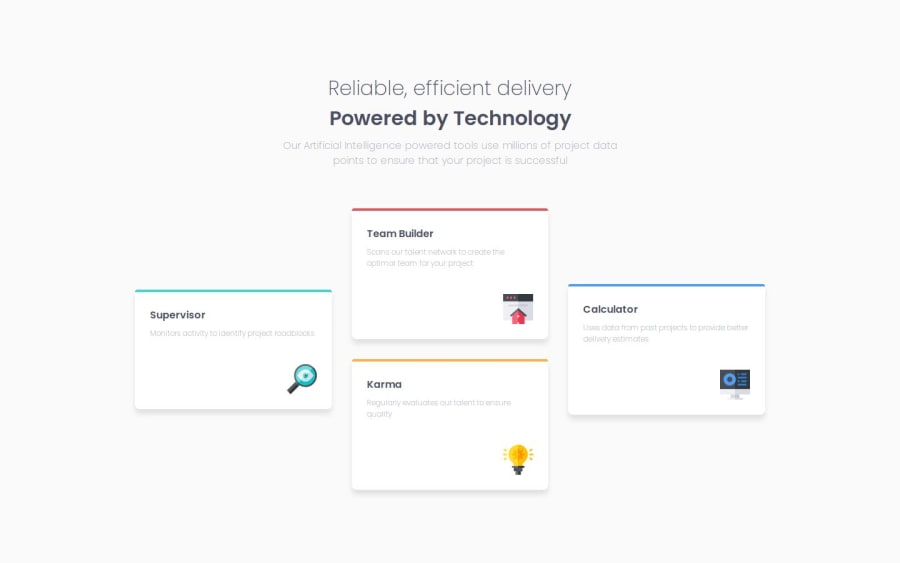
Desktop design screenshot for the Four card feature section coding challenge

This is a solution for...

  • HTML
  • CSS
1newbie
View challenge

Design comparison


SolutionDesign

Solution retrospective


What are you most proud of, and what would you do differently next time?

Getting the CSS grid to actually work, even if I am unhappy with it.

What challenges did you encounter, and how did you overcome them?

Getting CSS grid to work. Honestly, for some reason, CSS grid is so hard for me to wrap my head around. After going through all the reading material, I actually felt like I had a solid grasp of it, finally! But then I went to actually do it, and it was not so easy. Getting the initial layout was pretty simple, actually. It was figuring how to make it responsive. I knew that I should do it without using media queries, but I could not figure it out, so I just resorted to using media queries.

What specific areas of your project would you like help with?

CSS Grid, haha. I'm sure someone better than me would like at my code and see so many dumb decisions. And, I know there is a way to do it without media queries but I couldn't figure it out.

Community feedback

P

@John-Davidson-8

Posted

Hi Carson,

Fellow newbie here.

Your project looks great. For me also it is a steep learning curve moving into CSS Grid. I could read as much theory all day long, but when it came to actually building a project with Grid, it was difficult.

It is strange how projects can be completed in various different ways. The way I used Grid is different I think to the way you have done so. Our html is very similar, however, the CSS is varies, yet the outcome of how it looks on the browser is good. I will paste my css below:

    display: grid;
    grid-template-columns: 1fr 1fr 1fr;
    grid-template-rows: 7.813rem 7.813rem 7.813rem 7.813rem 7.813rem;
    gap: 1.875rem;
  }
  .card img {
    margin-top: 2.5rem;
  }
  .card-yellow {
    grid-column: 2 / 3;
    grid-row: 3 / 5;
  }
  .card-aqua {
    grid-column: 1 / 2;
    grid-row: 2 / 4;
  }
  .card-red {
    grid-column: 2 / 3;
    grid-row: 1 /3;
  }
  .card-blue {
    grid-column: 3 / 4;
    grid-row: 2 / 4;
  }```

As you can see I am also learning how to read other folks code and give feedback,  I find this very difficult when my own code has so many holes in it!!

Anyway I hope this helps in some small way, as your code has helped me.

Marked as helpful

1

P

@Carson-Haskell

Posted

@John-Davidson-8 haha thanks man, it’s nice to know I’m not alone in my struggle 😅

I checked your project out and it looks fantastic! Your grid CSS is much more straightforward than mine, I love it—it’s almost overwhelming how many different ways you can solve the same problem 😂 Does this CSS exclude the responsive styling? How did you handle the change from the more complex desktop layout to the stacked mobile layout?

Thanks for the feedback, I appreciate it!!

0
P

@John-Davidson-8

Posted

Hi @Carson-Haskell,

Your still at the keyboard too lol😂.

I actually completed this project last year, and have had a 6 month break away from coding, due to work stuff. So coming back I am reviewing my completed projects on the Learning Path on FEM, which was not available when I started. So having to re-learn stuff!!

I think looking at this code, starting mobile first the main section on line 40 of the CSS I did section { display: grid; gap: 1.438rem; } When I commented this out on mobile view below 36rem, it stays the same, only the gap of 1.438rems is removed. The cards stay stacked. So perhaps I did not need Grid there, and only need it on the wider screen???

I think I used Firefox Developer Edition browser which is excellent for Grid. When you open dev tools and tick Grid (overlay grid) it helps visualise the column and rows. I have given this 3 columns, and 4 rows and it shows on the grid where each card begins and ends in columns and rows. Therefore, for instance the yellow card (Karma) column starts at 2 and ends at 3, row begins at 3 and ends at 5.

I am not good at explaining code, but Firefox Developer really helps me lay this out.

Frontend Mentor for me is the best way to learn, trial and error and keep on building!!

0

Please log in to post a comment

Log in with GitHub
Discord logo

Join our Discord community

Join thousands of Frontend Mentor community members taking the challenges, sharing resources, helping each other, and chatting about all things front-end!

Join our Discord