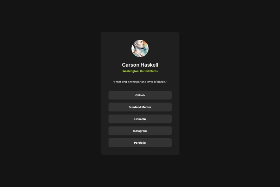
Design comparison
Solution retrospective
Implementing the Figma designs. That's what I am most unfamiliar with, but this time around I felt much more comfortable. I am proud of the fact that I felt comfortable and confident pretty much the entire time, and I knew exactly what to do and how to do it.
What challenges did you encounter, and how did you overcome them?Trying to make the profile social links accessible. This wasn't a code issue which is what made it so difficult to debug... Eventually, I discovered it was simply a Safari issue that was preventing me from being able to tab between the links.
Community feedback
- @Alex-Archer-IPosted 9 months ago
Hey!
Congrats with your new challenge =)
I can give a couple of suggestions. I guess there is no need for
aria-labeltags here. Screen reader would be able to read text content of the link, so aria attributes need when there is no one.Than
navisn't really fit there. The purpose of this tag to provide navigation throughout the site or the page. you should useultag here withliinside it.And I really recommend you to use
remat least for the font size. It's a special units which value depends on browser fonts settings, so it provides better UX and responsiveness.Overall, your work is neat, keep doing =)
1P@Carson-HaskellPosted 9 months agoThanks for the feedback, Alex!! I think I used
aria-labelin one of my attempts to get the accessibility tabbing to work, and then I forgot to remove it! Yeah, I wasn't sure about using thenav, but also using anulwithlifor links felt weird to me and unintuitive. So, I did some research, and this is what I found. I'm curious to hear your thoughts!- In this article, they write: "The
<nav>HTML element represents a section of a page whose purpose is to provide navigation links, either within the current document or to other documents. Common examples of navigation sections are menus, tables of contents, and indexes." - Because the social profile links are "navigation links," I thought maybe it would make sense, but I still wasn't convinced, until I read the next article (see below)
- In the article below, the author makes the case for
navwith nestedatags instead ofulnested withlilinks. - The author writes: "Either method of writing the navigation is valid HTML. However, if you are developing the web to work well for everyone, I recommend removing the unnecessary list element and simply using a
navwith nested anchor tags. This makes your markup simpler, while still being valid, and provides screen readers content that is easy to understand." - To see an example of how a screen reader would read both, check out the article!
Using nav without a list element
Let me know what you think, and thanks again for the feedback!
Oh, and lastly, I agree about the
remunites. I've always been bad at that and have had a hard time wrapping my head aroundremandemunits and what they are relative to and all that... I'll familiarize myself with them more! I just usedremin my latest project for the font sizes, thanks to your suggestion!@Alex-Archer-I
1@Alex-Archer-IPosted 9 months ago@Carson-Haskell
Oh, sorry, I wasn't very clear =)
I didn't suggest you to use
lielement as link (it means "list item"). I was talking about useainside them. Like this:<ul> <li><a href="#">It's a link here!</a></li> ...and more links here </ul>About the
navpart it still seems to me, that it's main purpose to navigate inside one site - and this part says exactly about thatCommon examples of navigation sections are menus, tables of contents, and indexes.. For sure,navcould contains links cos the site are often have multiple pages, but still it is inner navigation.So, I can agree about using
navwithoutul(especially short one), but still, I guess this is not the case here.As for
rem- it's value based on the font size of the root element. Default font size of roots in most browsers is16px, so you can use it for your calculations.emis depends on font size value too, bot it takes it from it's parent element. That whyemis less predictable and are used much less frequently.And thanks for the articles, they were useful and interesting =)
0 - In this article, they write: "The
- @Siyam1888Posted 9 months ago
Congratulations on completing the project!
I really appreciate your use of CSS variables for writing reusable code. Keep it up!
0
Please log in to post a comment
Log in with GitHubJoin our Discord community
Join thousands of Frontend Mentor community members taking the challenges, sharing resources, helping each other, and chatting about all things front-end!
Join our Discord
