@suruainoSubmitted over 1 year ago

Brandon Alobwede
@BrandaoAAll comments
- @BrandaoAPosted over 1 year ago
Hello. Your work is really good and great job. I just have one thing to add because I’m also really new to coding.
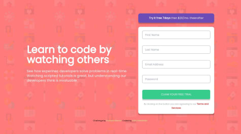
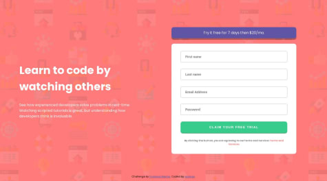
I think with the input for passwords you should rather use type=“password” instead of type=“text”. I say this because we always want our passwords hidden so no one can see them rather than make it visible to everyone. And with type of password, the password stays hidden and you can use JavaScript to toggle so it can be seen or hidden if you wish. And please don’t forget to mark on helpful if this comment was helpful to you.
HAPPY CODING🥳🥳
Marked as helpful0 - @vjaimesSubmitted over 1 year ago@BrandaoAPosted over 1 year ago
Hello. I went through your work and it’s good. But I think there are some few adjustment’s to make it great. When I tried submitting the form empty it popped up all the error messages which is good. But after that I tried inserting my first and last name without resetting the page and the error message continued to stay on, showing first name cannot be empty and my last name cannot be empty meanwhile I had already put in my first name and last name. Same thing happened when I tested the other inputs.
What I’m suggesting here is the error message has to disappear when the information has been filled in correctly and the form is submitted. That is to say try submitting the form first when it’s empty or lacking some information, then try refilling part of the form without resetting the page and intentionally leave out some information so you see if the error messages go out when the right information is put in.
The last part is your email validation. I think you needed to work on it. I tried submitting the form with a partial email for example (brandonlee@gmail.)and the form got submitted. I am new to programming but I believe every email needs to end with something that is either .com or .in or .co etc. so try to take that into consideration when doing your email validation.
Please let me know if my comment was helpful and follow me so you can also comment on my work and we help each other grow. HAPPY CODING🥳
Marked as helpful0 - @AmiredinSubmitted over 1 year ago@BrandaoAPosted over 1 year ago
Hello great Job. I like how you modified the phone view in your own way. It’s really nice. But I think you forgot to display the sub-links because I tried accessing them but it was not possible. Try adding it again to make your solution appear even better. HAPPY CODING🥳
0 - @JayJey96Submitted over 1 year ago@BrandaoAPosted over 1 year ago
Wow great job with this exercise. I am just a beginner in programming but I wish to contribute a little so your solution comes out exactly as the exercise. First always make sure your footer or header elements are links. Because in real life when creating your websites, the header and footer contains links to important aspects so the user can easily access them. So I think it is a good practice to always try it when doing any of the exercises that contain header or footer elements. Secondly I think you forgot about the hover effect on the social icons when we hover over them. To change the color of the icons, we can use the "filter" property in css.
"filter: invert(55%) sepia(98%) saturate(314%) hue-rotate(121deg) brightness(91%) contrast(95%);"
the code above will give you the exact color change you need.
If you need the links to the websites where you see more about this, just reply to me and i will be very happy to share with you HAPPY CODING
0 - @gabrielcarlos-devSubmitted over 1 year ago@BrandaoAPosted over 1 year ago
You did a good Job but i think you forgot to display the error message
0 - @tahobbit11Submitted almost 2 years ago@BrandaoAPosted almost 2 years ago
Good job. Just you had to make your work fit your entire pc screen so that it appears neat. Also, you forgot to change form cursor to pointer when your hover around the learn more button. Always try to remember that navigation elements are always links to some other part of your page. So remember to always use the "a " tag when creating your navigation elements.
Marked as helpful0 - @SymonhenriquedoValeSubmitted almost 2 years ago@BrandaoAPosted almost 2 years ago
you did a great job there carrying out this excercise. but i think i have a little suggestion to add as your card doesn't really appear at the center of the page.
TO CENTRALIZE CARD body { min-height: 100vh; display: grid; place-items: center; }
i think this code would help you centralisze your work instead of using a height 100vh and max-width 1400px. please let it know if it works out too
0 - @JeffersonSilemenSubmitted almost 2 years ago@BrandaoAPosted almost 2 years ago
I have actually learned something from your code. i never knew how to do the active state for the image but your code helped me. Thanks for this work
0