Design comparison
SolutionDesign
Community feedback
- @BrandaoAPosted almost 2 years ago
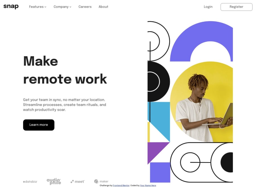
Good job. Just you had to make your work fit your entire pc screen so that it appears neat. Also, you forgot to change form cursor to pointer when your hover around the learn more button. Always try to remember that navigation elements are always links to some other part of your page. So remember to always use the "a " tag when creating your navigation elements.
Marked as helpful0
Please log in to post a comment
Log in with GitHubJoin our Discord community
Join thousands of Frontend Mentor community members taking the challenges, sharing resources, helping each other, and chatting about all things front-end!
Join our Discord
