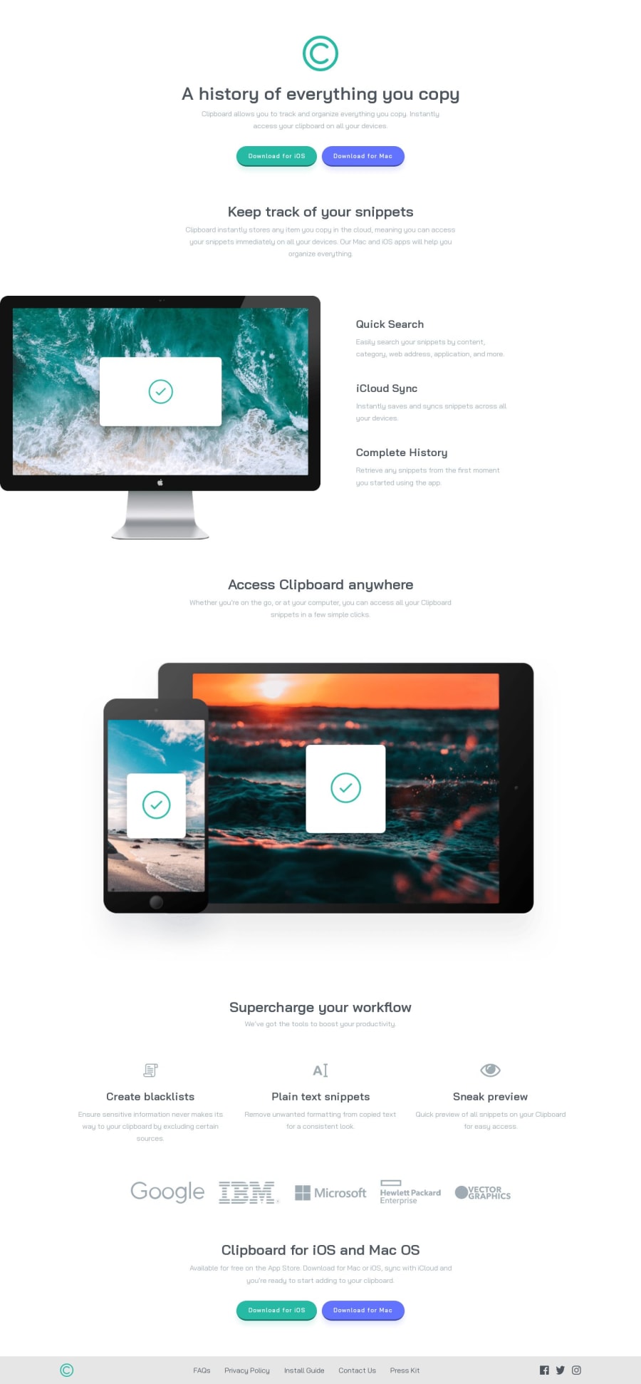
Design comparison
Community feedback
- @BrandaoAPosted almost 2 years ago
Wow great job with this exercise. I am just a beginner in programming but I wish to contribute a little so your solution comes out exactly as the exercise. First always make sure your footer or header elements are links. Because in real life when creating your websites, the header and footer contains links to important aspects so the user can easily access them. So I think it is a good practice to always try it when doing any of the exercises that contain header or footer elements. Secondly I think you forgot about the hover effect on the social icons when we hover over them. To change the color of the icons, we can use the "filter" property in css.
"filter: invert(55%) sepia(98%) saturate(314%) hue-rotate(121deg) brightness(91%) contrast(95%);"
the code above will give you the exact color change you need.
If you need the links to the websites where you see more about this, just reply to me and i will be very happy to share with you HAPPY CODING
0
Please log in to post a comment
Log in with GitHubJoin our Discord community
Join thousands of Frontend Mentor community members taking the challenges, sharing resources, helping each other, and chatting about all things front-end!
Join our Discord
