

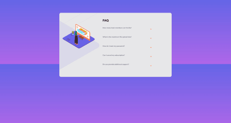
@guliye91Submitted over 4 years ago
Latest solutions
 No solutions submitted yet.
Latest comments
- @Amir-JacobsPosted over 4 years ago
Hi Guliye
I noticed a few things about your Javascript:
- I'd use functions to make clear what is happening. You could make a function called
resetAccordion()and a function calledshowAccordion(). - I'd make a bit more use of comments.
- The accordion can only be opened by clicking the icon, but it'd be more user-friendly to have it open upon clicking
.question.
Have a nice day. ✌
2 - I'd use functions to make clear what is happening. You could make a function called
- @RodrigoGamboaSubmitted over 4 years ago@Amir-JacobsPosted over 4 years ago
Hey Rodrigo,
I've taken a quick look and I noticed the following:
- Instead of
width: 375pxI'd usewidth: 100%; max-width: 375pxas this helps with responsive. - The blue background pattern images don't show up on mobile.
- I'd add a margin to the sides of the page on mobile, so that the card doesn't touch the edges. Something like
5pxto15pxshould be perfect. - You could use the BEM method for your CSS. Not really necessary here as it's pretty clear, but I'd look into it nonetheless.
Your code looks clean. Have a nice day. 😊
3 - Instead of
- @bryanmaraujo544Submitted over 4 years ago@Amir-JacobsPosted over 4 years ago
Hey Bryan
I've taken a look and I noticed the following things:
- Your responsive design (376px and up) has some flaws.
- You tend to use
>in your CSS. I would make the elements specific by utilizing the BEM method. - You're using CSS variables -- that's great.
Happy coding 😄
0 - @Karimsamir112Submitted over 4 years ago@Amir-JacobsPosted over 4 years ago
Hi Karim
I took a quick look and I have some suggestions:
- I'd stop using
<br>to create space between elements. Instead, usemarginorpadding. - Your indentation could be improved -- perhaps look at how a code beautifier would indent your code.
- In some cases I see inline-styling (such as
<h1 style="font-size: 65px">2.7m+</h1>. I would put all styling in your CSS file instead. - Your class names and id's could be more descriptive. It's difficult to immediately tell what
#finalor#final2is. - You also have some html and accessibility issues (there's a report of it on this page).
You're on the right track. 😄
2 - I'd stop using
- @vsm1996Submitted over 4 years ago@Amir-JacobsPosted over 4 years ago
Looks great! I love that you put the CSS files with the corresponding component -- before this I'd have it under
./src/css.The only thing I'd change is I'd use functional components.
1 - @AngelARVMSubmitted over 4 years ago@Amir-JacobsPosted over 4 years ago
I love your usage of variables in CSS. I also like that you've used prefixes where needed.
Some things I'd do differently are:
- Change
width: x%towidth: 100%; max-width: x%, as this helps with responsive design. - I'd limit the amount of classes I put on the html elements, because it becomes harder to read otherwise (though I understand that with bootstrap it's inevitable to add classes). I'd look into the BEM method.
- I noticed you need to use
margin-top: -340px; margin-right: -340px;on a class, which points to an issue in a part of the CSS.
Overall it looks clean and structured. :)
2 - Change