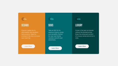
This time I learned and practiced using the CSS grid instead of relying on media queries. Any feedback is welcome!
Adarsh Rai
@AdarshRai0All comments
- @NataMelladoSubmitted 10 months ago@AdarshRai0Posted 10 months ago
I would like to express my appreciation for the meticulous organization of your file structure and the thoughtful approach you have employed in crafting the code structure. Your attention to detail and commitment to maintaining such high standards are commendable. Keep up the excellent work.
0 - @MartinsitoBritoDiazSubmitted over 2 years ago
Hi, front end mentor community! This is my soluction to FAQ According Card.
Happy to hear feedback and advice. ;)
@AdarshRai0Posted over 2 years agoHi Martinsito Brito Diaz , congratulations on your new challenge!✨🎯
0 - @MartinsitoBritoDiazSubmitted over 2 years ago
Hi, Front End Community! This is my soluction to FAQ According Card.
Happy to hear feedback and advice. ;)
@AdarshRai0Posted over 2 years agoHi Martinsito Brito Diaz , congratulations on your new challenge!✨🎯
0 - @AlexWesleyySubmitted over 2 years ago
Any feedback is welcome!!!
@AdarshRai0Posted over 2 years agoHi Alex Wesley , congratulations on your new challenge!✨🎯
Checkout
for more accurate solution you can check my solution so that you can have another angle to see
Marked as helpful0 - @dorian-edwardsSubmitted over 2 years ago@AdarshRai0Posted over 2 years ago
Hi Dorian Edwards , congratulations on your new challenge!✨🎯
I took a look at your code and I have some tips for you.🙌
If you want to improve your solution a bit I've two advice for your:
Consider adding a lang attribute to the html start tag to declare the language of this document.
<html lang="en">It is a best practice to use both HTML 5 and ARIA landmarks to ensure all content is contained within a navigational region. In HTML5, you should use elements like header, nav, main, and footer. Their ARIA counterparts are role="banner", role="navigation", role="main", and role="contentinfo", in that order. By using both HTML5 and ARIA markup, you make the webpage more robust and functional no matter what screen reader technology is used.
<header role="banner">
   <p>Put company logo, etc. here.</p>
</header>
<nav role="navigation">
   <ul>
      <li>Put navigation here</li>
   </ul>
</nav>
<main role="main">
   <p>Put main content here.</p>
</main>
<footer role="contentinfo">
   <p>Put copyright, etc. here.</p>
</footer>
Ensure all content is contained within a landmark region, designated with HTML5 landmark elements and/or ARIA landmark regions.
Screen reader users can navigate to a section based on its HTML element or ARIA Landmark. For example , you might use ARIA Landmarks to provide a simple replacement for a skip navigation link, though the replacement is only useful for users of screen readers. Sighted users or people using screen enlargers won't benefit from the addition, so it's not a good practice to substitute ARIA landmarks for skip navigation links altogether.
<html lang="en">
    <head>
        <title>Hello</title>
    </head>
    <body>
        <header>This is the header</header>
        <nav>This is the nav</nav>
        <main>This is the main</main>
        <footer>This is the footer</footer>
    </body>
</html>
Marked as helpful1 - @dorian-edwardsSubmitted over 2 years ago
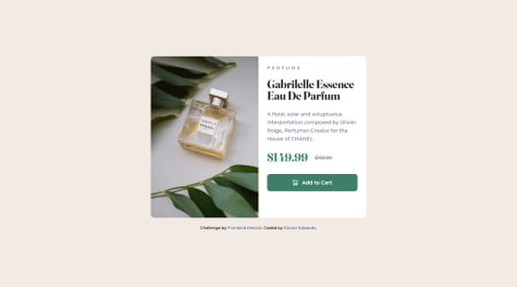
So many questions. I'm still wrapping my head around Typescript for starters. Having to declare the type of values passed as props is going to take some getting used to. And how can do this and still de-structure my props?
Using tailwindcss for the first time was also fun. I feel like using it more effectively will require more careful planning, e.g. setting up my theme configuration rather than shotgunning values into every class using square brackets.
I'm also not sure what the best way to deploy a react-app to github is. I lazily uploaded the production build so nothing can be seen of the individual components or anything. I'll probably go back and fix this after a bit of research...
@AdarshRai0Posted over 2 years agoHi Dorian Edwards , congratulations on your new challenge!✨🎯
I took a look at your code and I have some tips for you.🙌
If you want to improve your solution a bit I've two advice for your:
Consider using the h1 element as a top-level heading only (all h1 elements are treated as top-level headings by many screen readers and other tools).
rfume</h3><h1 class=product-title bold mb-[1.6rem] text-dk-blu>GabrilMarked as helpful1 - @LucianofittiSubmitted over 2 years ago
Easy layout, difficult to make it responsive. Any feedback is welcome.
@AdarshRai0Posted over 2 years agoHi Luciano Fittipaldi , congratulations on your new challenge!✨🎯
I took a look at your code and I have some tips for you.🙌
If you want to improve your solution a bit I've two advice for your:
Consider adding a lang attribute to the html start tag to declare the language of this document.
<html lang="en">Generally, it is a best practice to ensure that the beginning of a page's main content starts with a h1 element, and also to ensure that the page contains only one h1 element.
Usually the best practice is to start the main content of a web page with a level 1 heading (h1), with no other headings before this high-level heading. Mark the sub-sections of the page as level 2 headings (h2). If the level 2 sections contain sub-sections, mark these children as level 3 sections (h3) and so on.
Ensure all content is contained within a landmark region, designated with HTML5 landmark elements and/or ARIA landmark regions.
<html lang="en">
    <head>
        <title>Hello</title>
    </head>
    <body>
        <header>This is the header</header>
        <nav>This is the nav</nav>
        <main>This is the main</main>
        <footer>This is the footer</footer>
    </body>
</html>
Marked as helpful1 - @DevibtissamSubmitted over 2 years ago
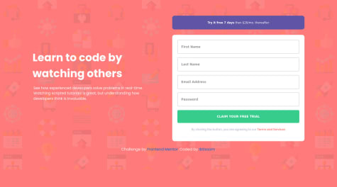
Hello, Frontend Mentor community! Here is my solution to the Intro component with the sign-up form challenge.
Happy to hear any feedback and advice
@AdarshRai0Posted over 2 years agoHi Ibtissam , congratulations on your new challenge!✨🎯
1 - @stripedtshirtSubmitted over 2 years ago
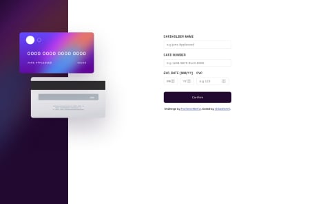
Please can someone tell me how to update only one part of the card at once. i am pretty new to javascript
@AdarshRai0Posted over 2 years agoHi stripedtshirt , congratulations on your new challenge!✨🎯
I took a look at your code and I have some tips for you.🙌
If you want to improve your solution a bit I've two advice for your:
checkout my solution of this challenge it help help you Improve your code
Marked as helpful0 - @Abdelrahman0KhaledSubmitted over 2 years ago
I am still learning ..i took this challenge to apply what I learned, not as a challenge. this is my first with media quire and it toke a long time with me ..i need you take a look in my code and tile me if something not good or bad can i change it.. all feedback is welcome❤️
@AdarshRai0Posted over 2 years agoHi Abdelrahman Khaled , congratulations on your new challenge!✨🎯
I took a look at your code and I have some tips for you.🙌
If you want to improve your solution a bit I've two advice for your:
Consider adding a lang attribute to the html start tag to declare the language of this document.
<html lang="en">Generally, it is a best practice to ensure that the beginning of a page's main content starts with a h1 element, and also to ensure that the page contains only one h1 element.
Usually the best practice is to start the main content of a web page with a level 1 heading (h1), with no other headings before this high-level heading. Mark the sub-sections of the page as level 2 headings (h2). If the level 2 sections contain sub-sections, mark these children as level 3 sections (h3) and so on.
Links must have discernible text
Context:
<a href="#"> <img src="images/icon-document.svg" alt=""> </a>Don't use a tag if not require. Ensure that all link names are accessible. It may be possible that the inner link text is not visible to a screen reader, that there are duplicate link labels, or that the link is not focusable.
Marked as helpful0 - @winprnSubmitted over 2 years ago
This challenge was fun. I added some features so that I can practice more JS. Hope you like it!
@AdarshRai0Posted over 2 years agoHi Ly Dinh Minh Man, congratulations on your new challenge!✨🎯
I took a look at your code and I have some tips for you.🙌
If you want to improve your solution a bit I've two advice for your:
Consider adding a lang attribute to the html start tag to declare the language of this document.
<html lang="en">Generally, it is a best practice to ensure that the beginning of a page's main content starts with a h1 element, and also to ensure that the page contains only one h1 element.
Usually the best practice is to start the main content of a web page with a level 1 heading (h1), with no other headings before this high-level heading. Mark the sub-sections of the page as level 2 headings (h2). If the level 2 sections contain sub-sections, mark these children as level 3 sections (h3) and so on.
Marked as helpful1 - @anoshaahmedSubmitted almost 3 years ago
Would appreciate any suggestions to improve my code!
@AdarshRai0Posted over 2 years agoWell done Anosha Ahmed ! I checked your solution just wanted to know how you make your solution exactly same as the design any tips it can help me to improve;✨🎯
0
