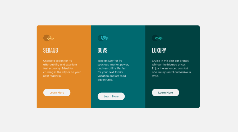
Design comparison
Solution retrospective
Easy layout, difficult to make it responsive. Any feedback is welcome.
Community feedback
- @AdarshRai0Posted over 2 years ago
Hi Luciano Fittipaldi , congratulations on your new challenge!✨🎯
I took a look at your code and I have some tips for you.🙌
If you want to improve your solution a bit I've two advice for your:
Consider adding a lang attribute to the html start tag to declare the language of this document.
<html lang="en">Generally, it is a best practice to ensure that the beginning of a page's main content starts with a h1 element, and also to ensure that the page contains only one h1 element.
Usually the best practice is to start the main content of a web page with a level 1 heading (h1), with no other headings before this high-level heading. Mark the sub-sections of the page as level 2 headings (h2). If the level 2 sections contain sub-sections, mark these children as level 3 sections (h3) and so on.
Ensure all content is contained within a landmark region, designated with HTML5 landmark elements and/or ARIA landmark regions.
<html lang="en">
    <head>
        <title>Hello</title>
    </head>
    <body>
        <header>This is the header</header>
        <nav>This is the nav</nav>
        <main>This is the main</main>
        <footer>This is the footer</footer>
    </body>
</html>
Marked as helpful1
Please log in to post a comment
Log in with GitHubJoin our Discord community
Join thousands of Frontend Mentor community members taking the challenges, sharing resources, helping each other, and chatting about all things front-end!
Join our Discord
