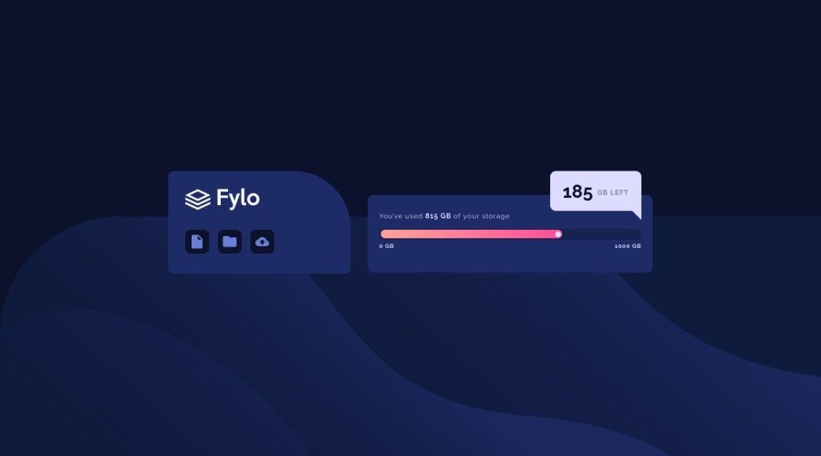
fylo-data-storage-component-master
Design comparison
Solution retrospective
I am still learning ..i took this challenge to apply what I learned, not as a challenge. this is my first with media quire and it toke a long time with me ..i need you take a look in my code and tile me if something not good or bad can i change it.. all feedback is welcome❤️
Community feedback
- @AdarshRai0Posted over 2 years ago
Hi Abdelrahman Khaled , congratulations on your new challenge!✨🎯
I took a look at your code and I have some tips for you.🙌
If you want to improve your solution a bit I've two advice for your:
Consider adding a lang attribute to the html start tag to declare the language of this document.
<html lang="en">Generally, it is a best practice to ensure that the beginning of a page's main content starts with a h1 element, and also to ensure that the page contains only one h1 element.
Usually the best practice is to start the main content of a web page with a level 1 heading (h1), with no other headings before this high-level heading. Mark the sub-sections of the page as level 2 headings (h2). If the level 2 sections contain sub-sections, mark these children as level 3 sections (h3) and so on.
Links must have discernible text
Context:
<a href="#"> <img src="images/icon-document.svg" alt=""> </a>Don't use a tag if not require. Ensure that all link names are accessible. It may be possible that the inner link text is not visible to a screen reader, that there are duplicate link labels, or that the link is not focusable.
Marked as helpful0
Please log in to post a comment
Log in with GitHubJoin our Discord community
Join thousands of Frontend Mentor community members taking the challenges, sharing resources, helping each other, and chatting about all things front-end!
Join our Discord
