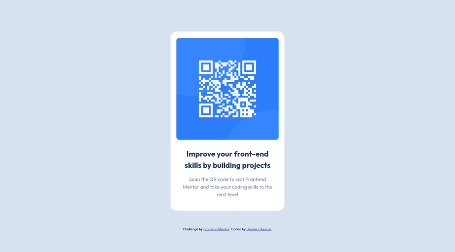
Design comparison
Community feedback
- @AdarshRai0Posted over 2 years ago
Hi Dorian Edwards , congratulations on your new challenge!✨🎯
I took a look at your code and I have some tips for you.🙌
If you want to improve your solution a bit I've two advice for your:
Consider adding a lang attribute to the html start tag to declare the language of this document.
<html lang="en">It is a best practice to use both HTML 5 and ARIA landmarks to ensure all content is contained within a navigational region. In HTML5, you should use elements like header, nav, main, and footer. Their ARIA counterparts are role="banner", role="navigation", role="main", and role="contentinfo", in that order. By using both HTML5 and ARIA markup, you make the webpage more robust and functional no matter what screen reader technology is used.
<header role="banner">
   <p>Put company logo, etc. here.</p>
</header>
<nav role="navigation">
   <ul>
      <li>Put navigation here</li>
   </ul>
</nav>
<main role="main">
   <p>Put main content here.</p>
</main>
<footer role="contentinfo">
   <p>Put copyright, etc. here.</p>
</footer>
Ensure all content is contained within a landmark region, designated with HTML5 landmark elements and/or ARIA landmark regions.
Screen reader users can navigate to a section based on its HTML element or ARIA Landmark. For example , you might use ARIA Landmarks to provide a simple replacement for a skip navigation link, though the replacement is only useful for users of screen readers. Sighted users or people using screen enlargers won't benefit from the addition, so it's not a good practice to substitute ARIA landmarks for skip navigation links altogether.
<html lang="en">
    <head>
        <title>Hello</title>
    </head>
    <body>
        <header>This is the header</header>
        <nav>This is the nav</nav>
        <main>This is the main</main>
        <footer>This is the footer</footer>
    </body>
</html>
Marked as helpful1 - @iprinceroyyPosted over 2 years ago
That's excellent work @dorian-edwards. You need to focus on some key points here:-
- There should be one heading tag on a web page, if there is no heading element requirement, then set its font size to 0. h1{ font-size: 0; }
- The content should be wrapped inside the main landmark to avoid accessibility issues. Like this <body><main>your content goes here......</main></body>.
Hope it adds to your learning. Happy coding :)
Marked as helpful1
Please log in to post a comment
Log in with GitHubJoin our Discord community
Join thousands of Frontend Mentor community members taking the challenges, sharing resources, helping each other, and chatting about all things front-end!
Join our Discord
