@KSnape34

Khalid Benhamou
@5alidevAll comments
- @5alidev
Congratulations on completing the newsletter sign-up project!
On reviewing your code, I noticed a potential improvement with the success message. Currently, the mobile version's image seems to be used for desktop as well. Consider using a separate illustration specifically designed for desktop to enhance the user experience on larger screens.
Secondly, regarding the GitHub repository, there's a way to optimize file management. You can ignore pushing the
designfolder andstyle-guide.mdto the main branch. This can be easily achieved by adding them to the .gitignorefile like this:/design /style-guide.mdIgnoring these files helps keep the repository focused on the core code and avoids unnecessary clutter.Overall, great work on the project! Keep up the good coding!
- P@nvallineWhat are you most proud of, and what would you do differently next time?
This was a fairly straight forward challenge and I feel like I was able to complete the HTML & CSS fairly quickly.
What challenges did you encounter, and how did you overcome them?Deciding how to manage the JavaScript to complete the desired actions for the share icon was a challenge at first. I decided to add/remove classes when the share icon was clicked.
What specific areas of your project would you like help with?If there is a better way to handle the JavaScript interactivity, I am all ears.
@5alidevCongratulations on completing the challenge! Your solution is impressive and closely mirrors the provided one. I believe being a pro member and having access to the original Figma files made a difference. Keep up the excellent work. Just a small note: in your GitHub repository, you can exclude the design directory from uploading.
- @taiwogbadamosiWhat are you most proud of, and what would you do differently next time?
Grid was easier than I thought!
What challenges did you encounter, and how did you overcome them?the structure of each div was way more complex than i expected! i thought that would be a breeze but it took up the majority of my time.
What specific areas of your project would you like help with?None
@5alidevFirstly, congratulations on completing the challenge. I have a few minor suggestions for you: 1- Consider using a separate CSS file for styling. 2- You might want to add a wrapper or container to your cards for perfect and easy centering. 3- You can remove unnecessary files from your GitHub repository, such as the Design folder, README-template.md, style-guide.md, and the .vscode folder.
Overall, your solution is good and responsive; it just needs some minor retouching.
Marked as helpful - @Sekarsk18@5alidev
Congratulations on completing the challenge! Your solution looks great, and I've learned from it. Keep up the good work.
- @gia-grigalashvili@5alidev
Firstly, congratulations on completing the challenge. I have just a few minor notes for you:
1- The image isn't loading in the desktop version, so please double-check the image source to ensure its correct. 2- The Button icon and text aren't perfectly aligned. Overall, your design is good and closely resembles the original, especially regarding the card size.
- @CMP2007What are you most proud of, and what would you do differently next time?
Even with the limitation of having the measurements of the element, I feel that I managed to recreate the dimensions and positions of the elements in the project quite well.
What challenges did you encounter, and how did you overcome them?Actually, due to work reasons, I have not had the time I would like to dedicate to programming, so this project was a way to review basic knowledge.
What specific areas of your project would you like help with?I still have very little experience with this type of practice, so I would appreciate any opinions or suggestions, especially if you find any mistakes I have made or any aspects in which I can improve.
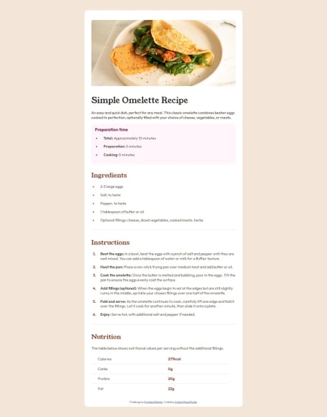
@5alidevGood job! Nothing to add. Just a small note: when the width is 375px or below, the recipe image is not centered. You may want to consider fixing that.
- @RAPHJIDWhat are you most proud of, and what would you do differently next time?
Everything
What challenges did you encounter, and how did you overcome them?Responsiveness
What specific areas of your project would you like help with?None
@5alidevFirst of all, congratulations on finishing the project! Here are some suggestions that may interest you: 1- the image is squished, when playing with image height and width it's always a good practice to use:
object-fit: cover;2- when hovering on the links, think of changing the background color to the greenish color they providedhsl(75, 94%, 57%). Overall, your solution is good and closely resembles the provided design. 👍 - @emersonocorrea@5alidev
First of all, congratulations on finishing the project! 🎉 Here are some suggestions that may interest you:
1- For the background color, you may consider using the yellow color provided in the project's style guide, which is
#F4D04E. 2- I noticed that you used different font sizes and weights for your <p> tags and the author's name compared to the provided ones. 3- When hovering on the card, consider expanding the card's box shadow as well. Overall, your solution is good and closely resembles the provided design. 👍 - @devanshu75What are you most proud of, and what would you do differently next time?
I'm most proud of that I am able to create a scalable website which are easy to maintain. I am looking forward to write more clean and readable code.
What challenges did you encounter, and how did you overcome them?Challenge which I encounter by solving this problem was to identity the correct font family and develop the same card which was provided in the figma
@5alidev🎉 First of all, congratulations on finishing the project! Here are some suggestions that may interest you:
1- Consider using a <main> tag instead of the <div class="card-body"> to improve the accessibility of your website. 2- In the provided styling guide, they mention that you need to use the Outfit font with these properties: for paragraphs: Font size (paragraph): 15px. 3- In line 18 of your HTML code, for your card title, you should use an <h1> element instead of a <p> tag for good HTML structuring. 4- In the provided design, the card has a light box shadow; you may consider adding it. 5- You may also consider adding a media query for mobile screens: @media only screen and (max-width: 375px) { /* Your CSS rules */ } Overall, your solution is good and closely resembles the provided design. 👍
Marked as helpful