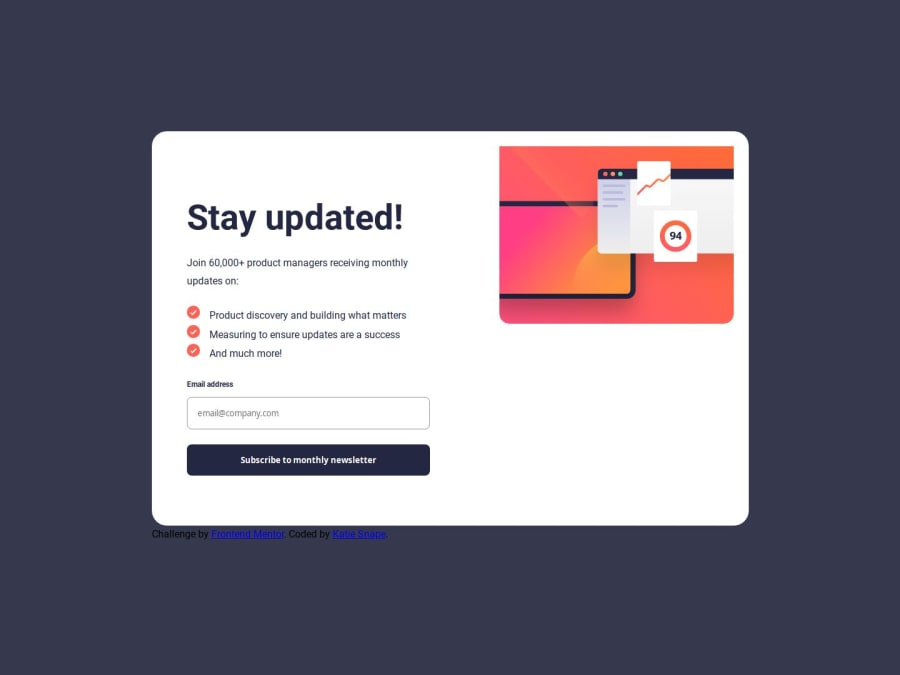
Design comparison
Community feedback
- @5alidevPosted 6 months ago
Congratulations on completing the newsletter sign-up project!
On reviewing your code, I noticed a potential improvement with the success message. Currently, the mobile version's image seems to be used for desktop as well. Consider using a separate illustration specifically designed for desktop to enhance the user experience on larger screens.
Secondly, regarding the GitHub repository, there's a way to optimize file management. You can ignore pushing the
designfolder andstyle-guide.mdto the main branch. This can be easily achieved by adding them to the .gitignorefile like this:/design /style-guide.mdIgnoring these files helps keep the repository focused on the core code and avoids unnecessary clutter.Overall, great work on the project! Keep up the good coding!
0
Please log in to post a comment
Log in with GitHubJoin our Discord community
Join thousands of Frontend Mentor community members taking the challenges, sharing resources, helping each other, and chatting about all things front-end!
Join our Discord
