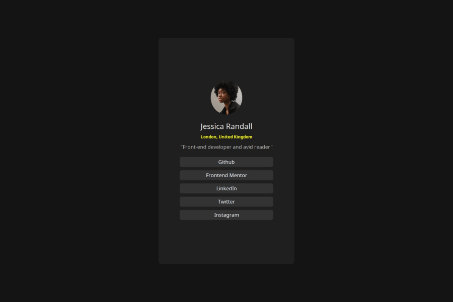
Design comparison
SolutionDesign
Solution retrospective
What are you most proud of, and what would you do differently next time?
Everything
What challenges did you encounter, and how did you overcome them?Responsiveness
What specific areas of your project would you like help with?None
Community feedback
- @5alidevPosted 7 months ago
First of all, congratulations on finishing the project! Here are some suggestions that may interest you: 1- the image is squished, when playing with image height and width it's always a good practice to use:
object-fit: cover;
2- when hovering on the links, think of changing the background color to the greenish color they providedhsl(75, 94%, 57%)
. Overall, your solution is good and closely resembles the provided design. 👍0
Please log in to post a comment
Log in with GitHubJoin our Discord community
Join thousands of Frontend Mentor community members taking the challenges, sharing resources, helping each other, and chatting about all things front-end!
Join our Discord