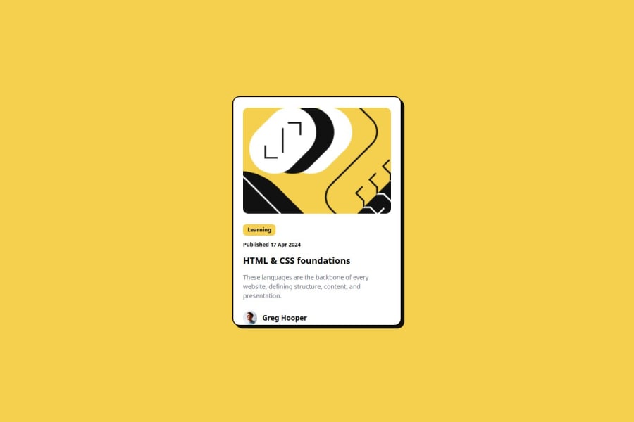
responsive card created using html, tailwindcss
Design comparison
Community feedback
- @5alidevPosted 7 months ago
First of all, congratulations on finishing the project! 🎉 Here are some suggestions that may interest you:
1- For the background color, you may consider using the yellow color provided in the project's style guide, which is
#F4D04E. 2- I noticed that you used different font sizes and weights for your <p> tags and the author's name compared to the provided ones. 3- When hovering on the card, consider expanding the card's box shadow as well. Overall, your solution is good and closely resembles the provided design. 👍0@emersonocorreaPosted 7 months agoThank you for your comment, I've already made the changes you mention and it's already on the live site @5alidev
1
Please log in to post a comment
Log in with GitHubJoin our Discord community
Join thousands of Frontend Mentor community members taking the challenges, sharing resources, helping each other, and chatting about all things front-end!
Join our Discord
