Design comparison
Community feedback
- @saularangurenPosted 11 months ago
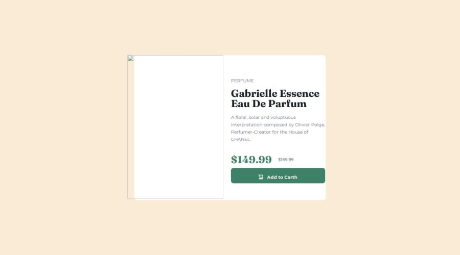
greetings friend, your solution is really impressive, however, we can improve it by adding to the
imgelement the following./at the beginning of each image path within thesrcattribute like this:<img src="./example.png">This is how your code correction should look:
<img class="mobile-img" src="./images/image-product-mobile.jpg" alt="">
<img class="desptop-img" src="./images/image-product-desktop.jpg" alt="">
happy codign 😁
0 - @5alidevPosted 11 months ago
Firstly, congratulations on completing the challenge. I have just a few minor notes for you:
1- The image isn't loading in the desktop version, so please double-check the image source to ensure its correct. 2- The Button icon and text aren't perfectly aligned. Overall, your design is good and closely resembles the original, especially regarding the card size.
0
Please log in to post a comment
Log in with GitHubJoin our Discord community
Join thousands of Frontend Mentor community members taking the challenges, sharing resources, helping each other, and chatting about all things front-end!
Join our Discord
