


@victoriamnxSubmitted almost 2 years ago
Hi, I'm Omar Currently, I am a business management student and novice front-end developer. As a front-end developer, my abilities and knowledge include JavaScript, node.js, HTML & CSS, preprocessor SASS, responsive design, React and Vite.
I’m currently learning...Currently learning React
Latest solutions
Space tourism website multi-page
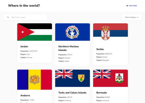
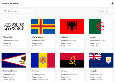
#react#react-router#sass/scss#typescript#redux-toolkitSubmitted almost 2 years agoREST Countries API with color theme switcher
#react#react-router#styled-components#typescript#redux-toolkitSubmitted almost 2 years agoTodo app create with React.js using localStorage
#accessibility#react#styled-components#viteSubmitted about 2 years ago
Latest comments
- @0marDPosted almost 2 years ago
Great job, well done! Just adjust the borders and width of the card. In its mobile version, it appears too large, and some borders are not clearly defined. I recommend using variables for frequently repeated styles, such as colors. The default height is automatic, but if you want to adjust it, you can use the "aspect-ratio" property. Regarding the card's width, I suggest using relative width with absolute min-width and max-width values. Lastly, avoid using the "!important" flag; it's considered bad practice. I have never encountered a situation where its use is justified. Best regards.
Marked as helpful0 - @2saucySubmitted almost 2 years ago@0marDPosted almost 2 years ago
What did you find challenging? Well, I'm not an expert, but I hope to help you a bit. From what I can see, you didn't adjust the font size correctly. When hovering over the cards, they grow too much, and I think the animation is a bit long. Make sure the cards have the same size. You can use the CSS property "aspect-ratio" or manually set the width and height. The theme color change seems to take too long. I'm not sure if it's due to JavaScript or an HTML/CSS issue. In the mobile version, the images overflow, and the title next to the header is too large. Apart from that, everything looks good. Great job! Congratulations, bro.
1 - @JuanCarlosAT96Submitted almost 2 years ago@0marDPosted almost 2 years ago
What do you mean by "mobile resolution"? Could you please clarify?
1 - @Zy8712Submitted almost 2 years ago@0marDPosted almost 2 years ago
You can achieve this using CSS pseudo-elements, such as "after" or "before," which have a display property of "block" or "flex." When hovering over the image, the pseudo-element should be visible, and when not hovering, it should have a display property of "none." Alternatively, you can also use other elements like "img" or "div," and the steps would remain the same.
0