Responsive countries app using React App
Design comparison
Solution retrospective
Feedback is greatly appreciated, so that I can continue to improving my skills 💕
Community feedback
- @0marDPosted almost 2 years ago
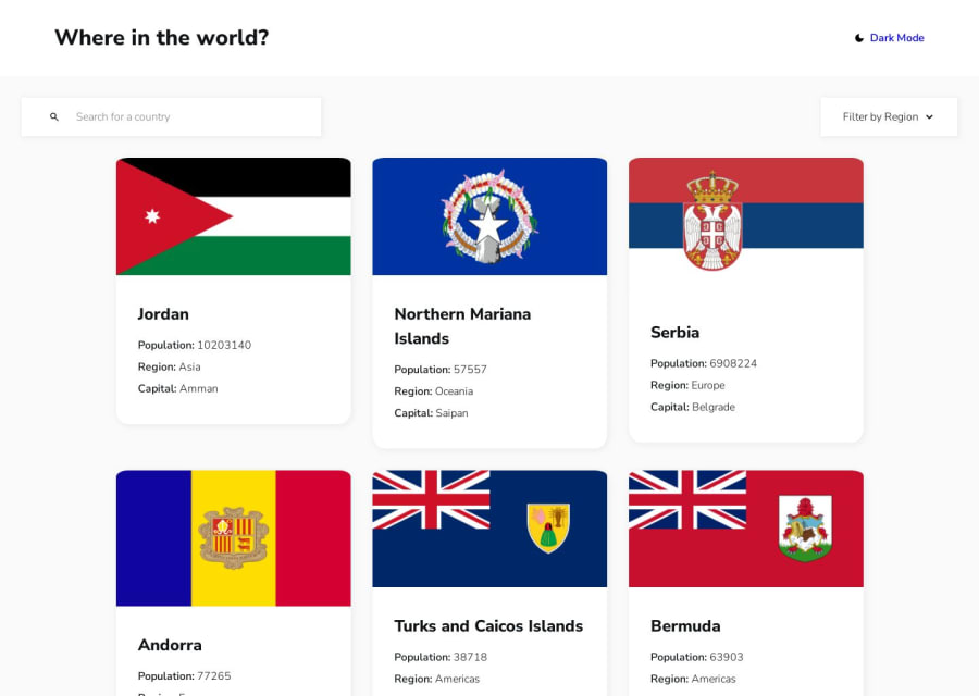
What did you find challenging? Well, I'm not an expert, but I hope to help you a bit. From what I can see, you didn't adjust the font size correctly. When hovering over the cards, they grow too much, and I think the animation is a bit long. Make sure the cards have the same size. You can use the CSS property "aspect-ratio" or manually set the width and height. The theme color change seems to take too long. I'm not sure if it's due to JavaScript or an HTML/CSS issue. In the mobile version, the images overflow, and the title next to the header is too large. Apart from that, everything looks good. Great job! Congratulations, bro.
1 - @leonardo9245Posted almost 2 years ago
I really liked your solution you did a great job, but there are some points that you could improve, some that I noticed:
- the cards are with different sizes.
- the header is too big for mobile screens.
- it would be nice if you added the option to see all the countries in your filter by region, because when I change the region there is no option to see all the countries again, would have to reload the page again to see all the countries.
1
Please log in to post a comment
Log in with GitHubJoin our Discord community
Join thousands of Frontend Mentor community members taking the challenges, sharing resources, helping each other, and chatting about all things front-end!
Join our Discord
