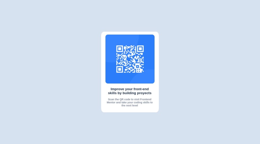
Design comparison
SolutionDesign
Solution retrospective
What did you find difficult while building the project?
R: the position of the component
Which areas of your code are you unsure of? R: the mobile resolution
Community feedback
- @0marDPosted almost 2 years ago
What do you mean by "mobile resolution"? Could you please clarify?
1 - @0xabdulkhaliqPosted almost 2 years ago
Hello there 👋. Congratulations on successfully completing the challenge! 🎉
- I have other recommendations regarding your code that I believe will be of great interest to you.
HEADINGS ⚠️:
- This solution consists incorrect usage of
<h2>so it can cause severe accessibility errors due to incorrect usage of level-two headings<h2>
- Every site must want only one
h1element identifying and describing the main content of the page.
- An
h1heading provides an important navigation point for users of assistive technologies, allowing them to easily find the main content of the page.
- In this solution there's
<h2>element which is this<h2>Improve your...</h2>, you can preferably use<h1>instead of<h2>. Remember<h1>provides an important navigation point for users of assistive technologies so we want to use it wisely
- So we want to add a level-one heading to improve accessibility
- Example:
<h1>Improve your front-end skills by building projects</h1>
- If you have any questions or need further clarification, and feel free to reach out to me.
- If you have any questions or need further clarification, you can always check out
my submissionand/or feel free to reach out to me.
.
I hope you find this helpful 😄 Above all, the solution you submitted is great !
Happy coding!
0
Please log in to post a comment
Log in with GitHubJoin our Discord community
Join thousands of Frontend Mentor community members taking the challenges, sharing resources, helping each other, and chatting about all things front-end!
Join our Discord
