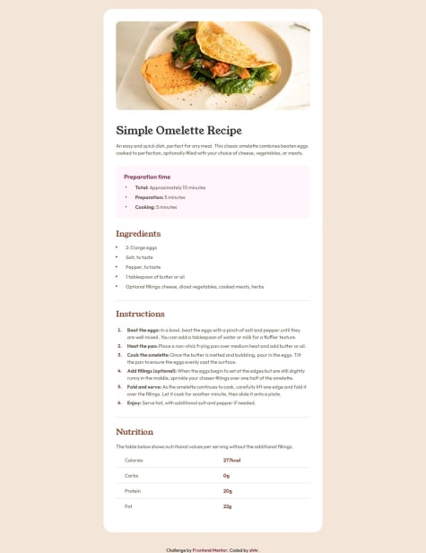
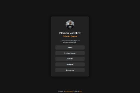
I’m most proud of creating a pixel-perfect, responsive QR code component that matches the design for both mobile (375px) and desktop (1440px) viewports. Using Flexbox to center the card and media queries to adjust spacing was a great learning experience, and I’m happy with how clean the layout looks. Next time, I’d focus on adopting a mobile-first approach from the start, as I initially wrote the CSS for desktop and then adjusted for mobile. I’d also experiment with CSS variables to manage colors more efficiently.
What challenges did you encounter, and how did you overcome them?One challenge was getting the card’s proportions and spacing to match the screenshot exactly, especially the rounded corners and shadow. I overcame this by tweaking the border-radius to 20px and using a softer shadow with box-shadow: 0 10px 20px rgba(0, 0, 0, 0.1). Another challenge was ensuring the design looked good on both 375px and 1440px viewports. I used media queries to adjust margins and font sizes slightly for mobile, ensuring the card didn’t feel cramped on smaller screens.
What specific areas of your project would you like help with?I’d like feedback on how to optimize my CSS for better maintainability, especially for managing colors and spacing. For example, should I use CSS variables or a utility-first approach like Tailwind CSS? I’d also appreciate advice on accessibility—how can I ensure the QR code component is accessible to screen readers, and are there better ways to handle the image’s alt text?


