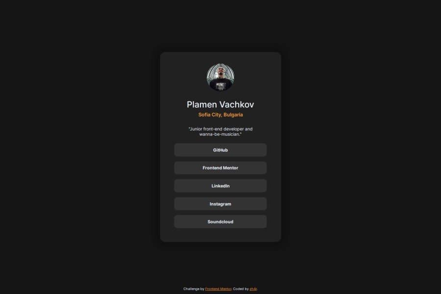
Social links Challenge | WarmColor/Shadows/SimpleAnimation | HTML5/CSS
Design comparison
Solution retrospective
Did much faster than previous challenge, while still adding more styles.
I love the look and feel of the final product.
What challenges did you encounter, and how did you overcome them?Couldn't figure out how to make the footer stick to the bottom while not in collision with other elements, and hide when it collides with the content above it.
Any ideas are welcome ^^
Overlooked some paddings and margins.
What specific areas of your project would you like help with?I would love for someone to give me a Meta tags/Accessibility review!
Community feedback
- @0xabdulkhaliqPosted 11 months ago
Hello there 👋. Congratulations on successfully completing the challenge! 🎉
- I have a suggestion regarding your code that I believe will be of great interest to you.
CSS 🎨:
- Let me explain, How you can easily center the component for better layout without usage of
absolutepositioning.
- We don't need to use
absoluteto center the component both horizontally & vertically. Because usingabsolutewill not dynamical centers our component at all states
- Using this method with also causes in cutting-off your component on mobile devices during their landscape mode.
- To properly center the component in the page, you should use
FlexboxorGridlayout. You can read more about centering in CSS here 📚.
- For this demonstration we use css
Gridto center the component
body { min-height: 100vh; display: grid; place-items: center; }- Now remove these styles, after removing you can able to see the changes
main {
  position: absolute;
  top: 50%;
  transform: translate(0, -50%);
}
- Now your component has been properly centered.
.
I hope you find this helpful 😄 Above all, the solution you submitted is great !
Happy coding!
Marked as helpful1 - P@danielmrz-devPosted 11 months ago
Hello there!
Congrats on completing the challenge! ✅
Your solution looks great!
📌 It's recommended to use semantic HTML elements like
<ul>and<li>for creating lists. This ensures that your code is more accessible, maintainable, and semantically meaningful.Here's and example on how you can refactor your code:
After Refactoring
<ul class="list-container">
    <li><a href="#">Github</a></li>
    <li><a href="#">Frontend Mentor</a></li>
    <li><a href="#">LinkedIn</a></li>
    ...
</ul>
By using
<ul>and<li>, you convey the structure of your content more clearly, making it easier for screen readers and search engines to understand. Additionally, it aligns with best practices for HTML semantics.I hope you find this helpful!
Keep up the excellent work!
Marked as helpful1@zh4rPosted 11 months ago@danielmrz-dev thank you! Will pay more attention to semantics from now on!
0 - @R3ygoskiPosted 11 months ago
Здравей zh4r, I'd like to congratulate you on completing your project. It turned out really well and quite original. It's always refreshing to see original projects on this platform. My sincere congratulations!
Regarding your question about
metatags, I have a few suggestions. You could also consider addingogandtwittermeta tags, but it's just a suggestion.Now, about the semantic (and consequently accessibility) aspect of your HTML, I have some suggestions for improvement. They are:
<div class="card">: This<div>could be replaced by an<article>tag, as the content here is independent and self-explanatory.<div class="links">: Instead of using a<div>, you could use a<ul>with<li>elements, as these buttons form a list since they share many similar characteristics.<div class="pv">: Instead of using a<div>here, you could use a<section>, as the content is thematically related to each other; they are all related to the profile.<h2>Sofia City, Bulgaria</h2>: The correct tag here wouldn't be an<h2>, but rather an<address>. This way, you would be indicating that it's an address.
Once again, congratulations on the creativity in approaching the challenge in a unique way. Keep practicing and improving. If anything I said isn't clear, please comment below, and I'll try to help as best as possible.
Marked as helpful1@zh4rPosted 11 months ago@R3ygoski, thank you so much for your comment! I'll save it as a note and come back to it while doing other challenges from now on :)
Honestly, I didn't even know there was an <address> tag, and using a list for the links is so obvious, I want to smack myself for not thinking of that!
Thanks again for your feedback, it's greatly appreciated!
Cheers!
1 - @zh4rPosted 11 months ago
@R3ygoski, Video was very well done, did the job beautifully.
I think I've achieved everything I aimed for in this challenge! I'll see you guys in the next one, hehe <3
1 - @zh4rPosted 11 months ago
@0xabdulkhalid @R3ygoski @danielmrz-dev I'm proud to say I've added all of your suggestions and everything looks much better!
I'll need to look deeper into @0xabdulkhalid's grid suggestion to understand it better.
Thank you all again for your kind words and constructive criticism, it's much appreciated!
Cheers!
1@R3ygoskiPosted 11 months agoHello again @zh4r, I'd like to give you a hand with this grid part.
Here are some extra links that might be of interest:
- CSS Tricks - Grid
- W3School - Grid
- Youtube - Slayng The Dragon [English Channel]
I hope these videos will be useful to help you with Grid.
Marked as helpful1
Please log in to post a comment
Log in with GitHubJoin our Discord community
Join thousands of Frontend Mentor community members taking the challenges, sharing resources, helping each other, and chatting about all things front-end!
Join our Discord
