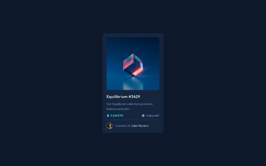
Design comparison
Solution retrospective
N/A
What challenges did you encounter, and how did you overcome them?N/A
What specific areas of your project would you like help with?N/A
Community feedback
- @mohamed-fmPosted 3 months ago
Great work! Consider adding some padding on the left and right in the body. Overall, the code is clean and impressive.
Marked as helpful1@zh4rPosted 3 months ago@mohamed-fm Thank you, this means a lot! Can you please elaborate on the body padding?
0@mohamed-fmPosted 3 months agoAdding some padding on the left and right, like this:
padding-left: 15px;
padding-right: 15px;
will prevent your card from sticking to the edges of the screen on mobile devices. This will enhance the user experience and improve the overall design. For reference, you can check out my solution to this challenge.
Marked as helpful1
Please log in to post a comment
Log in with GitHubJoin our Discord community
Join thousands of Frontend Mentor community members taking the challenges, sharing resources, helping each other, and chatting about all things front-end!
Join our Discord
